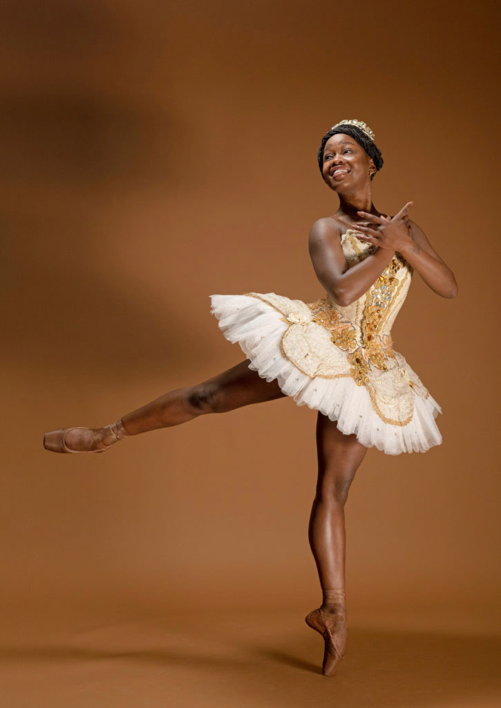
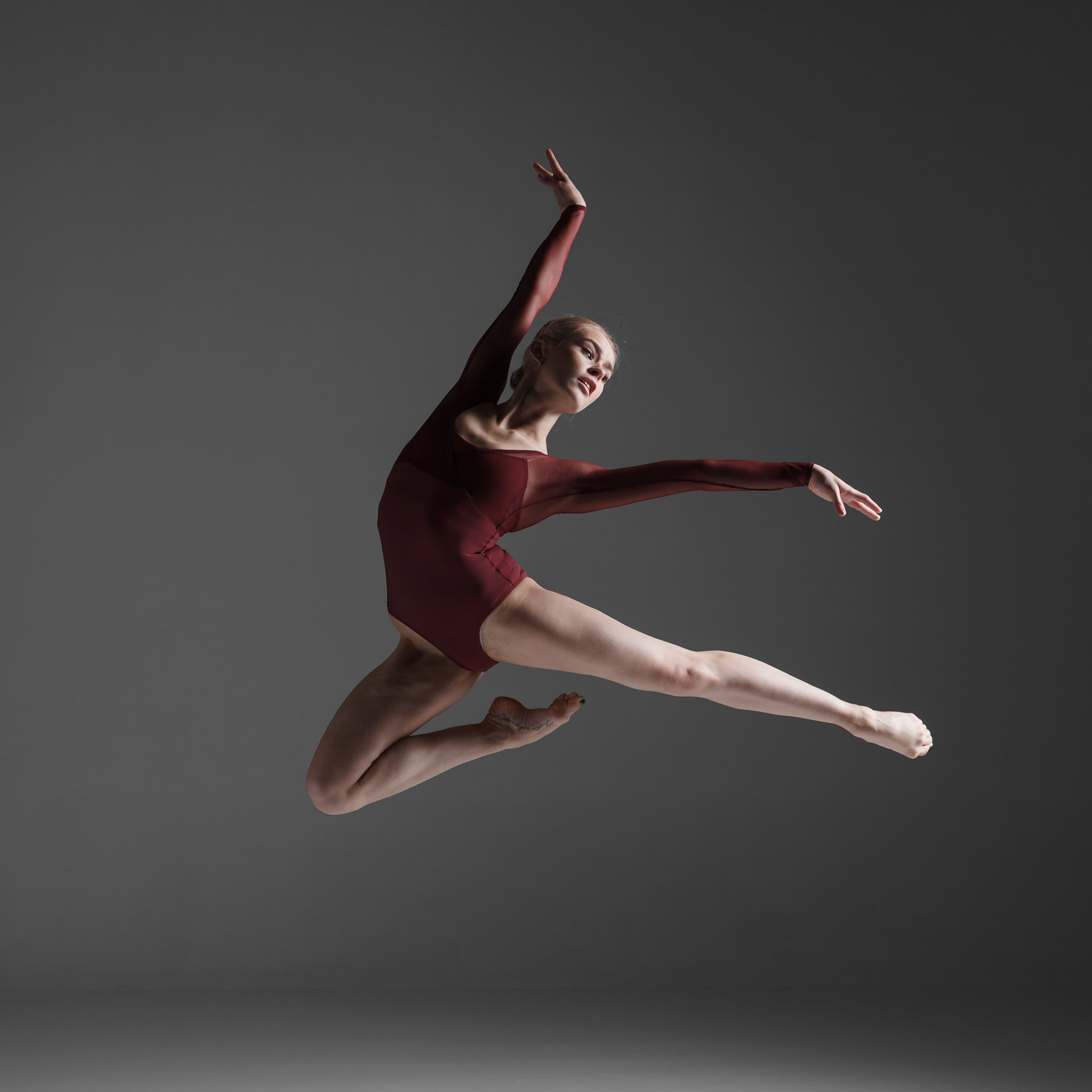
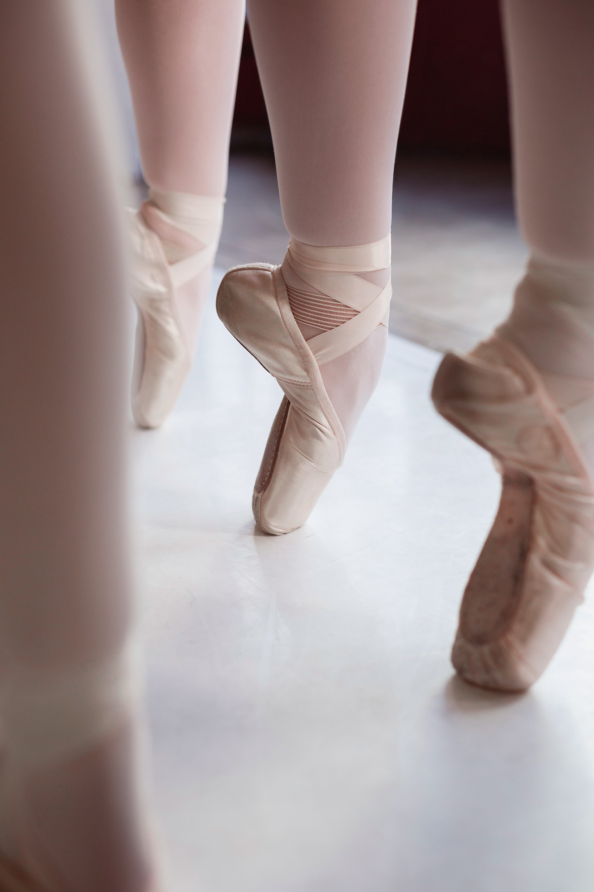
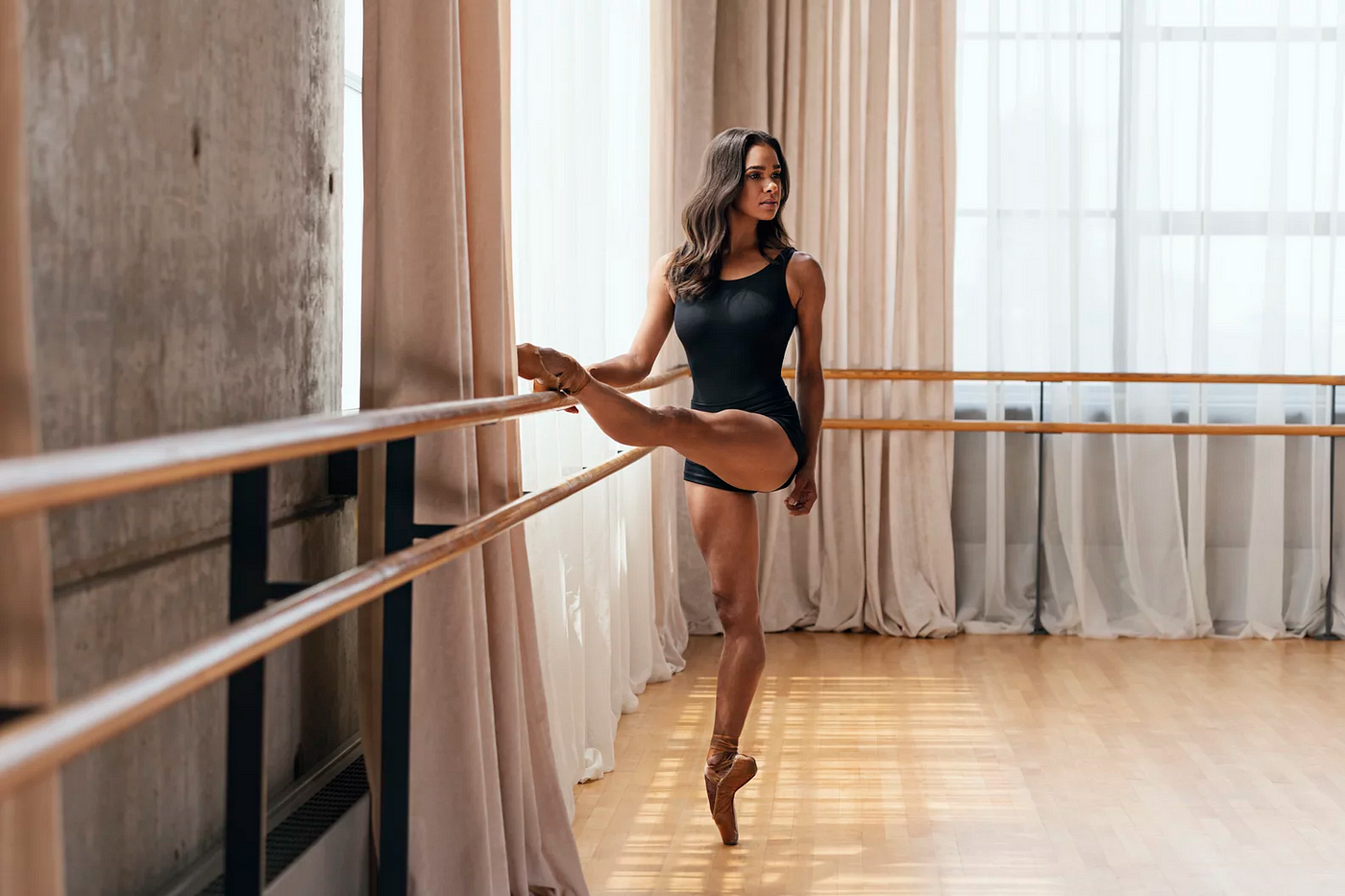
THE OBJECTIVE: Create an interesting and effective icon meant for a company selling ballet products. This company offers a number of items that you'd find in a ballet dancer's bag.
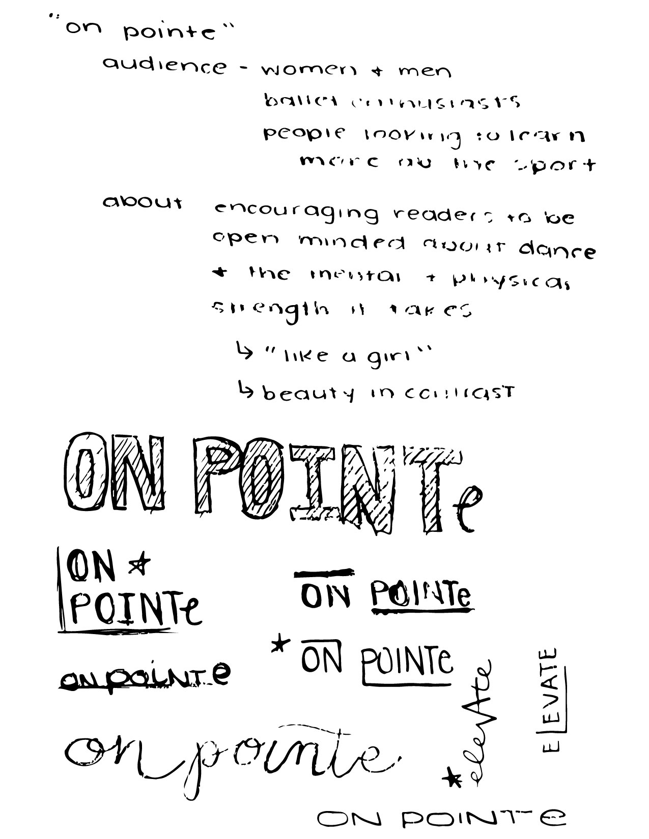
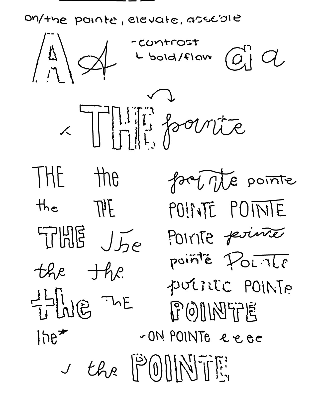
CONCEPT 1 SKETCHES: It was important to keep a sense of elegance while creating a wordmark that is interesting. While sketching, the main focus was creating contrast, and this was achieved through stroke weight and different type faces. The names "ON POINTe" and "The Pointe" were the first successful concepts.
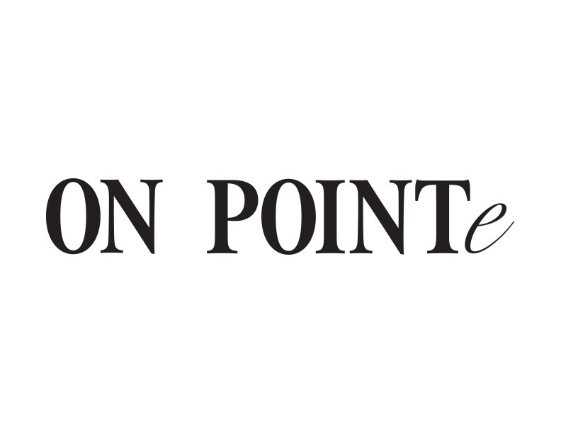
CONCEPT 1 DIGITAL ITERATIONS: Concept 1 was an in-your-face, high contrast wordmark. This mark used Acumin Pro Condensed and Absolute Beauty typefaces for maximum contrast.


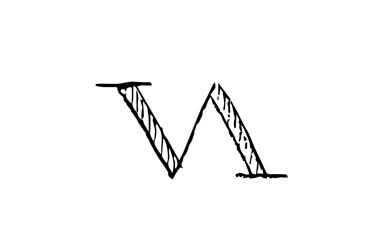
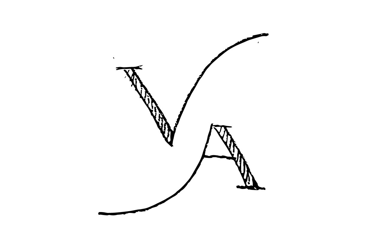
CONCEPT 2 SKETCHES: Concept 2 focused more on elegance. The V and the A being next to each other created a perfect opportunity to experiment on their forms.
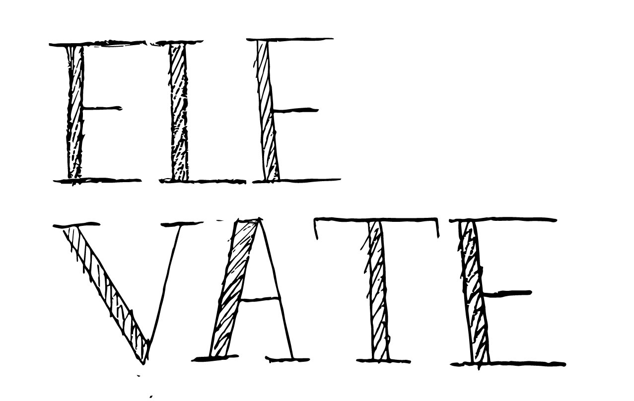
CONCEPT 2 DIGITAL ITERATIONS: Concept 2 used Didot as a base type face. Instead of the extreme contrast from the bold type to the script, concept 2's contrast is seen in stroke weight.


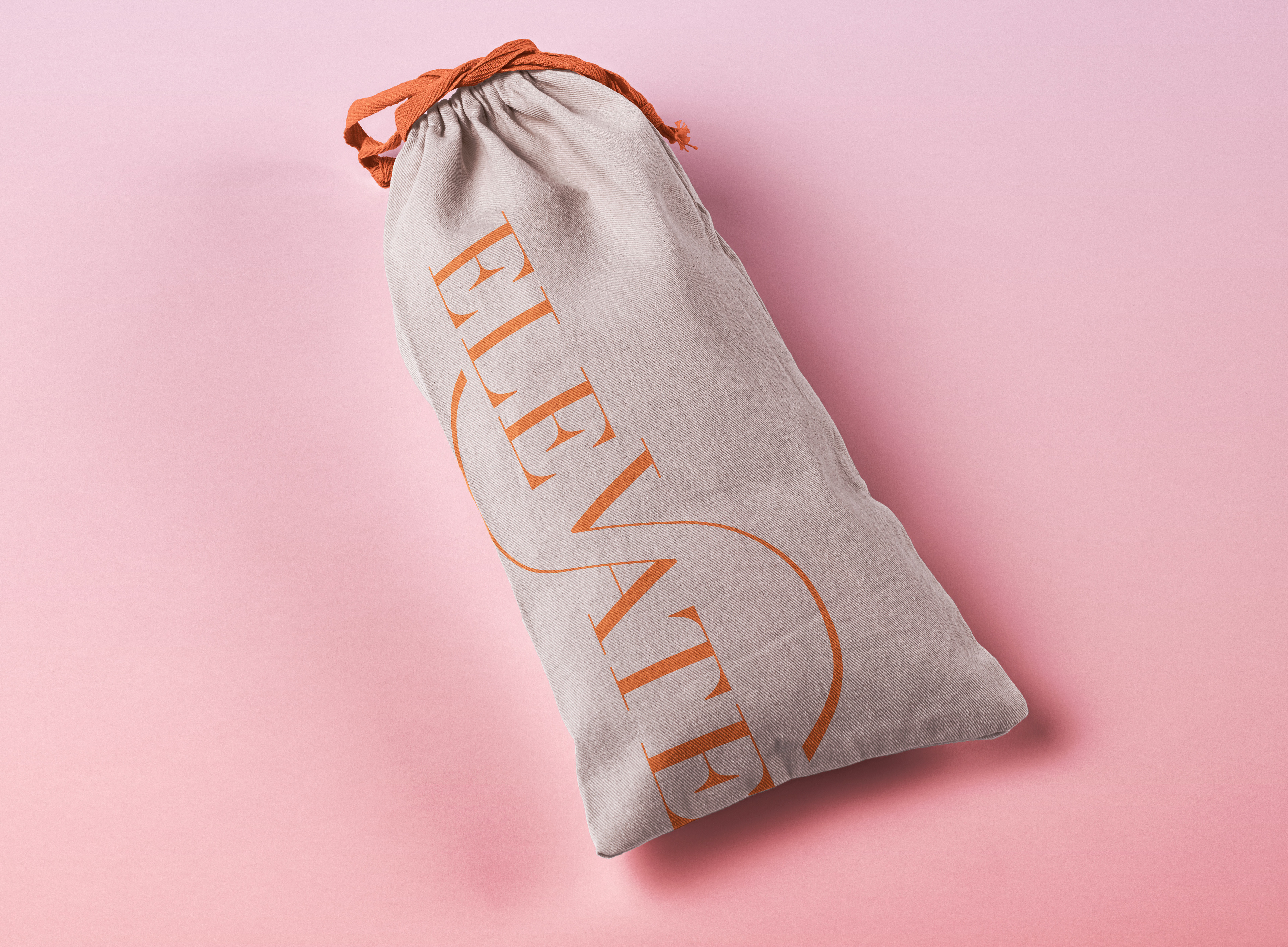
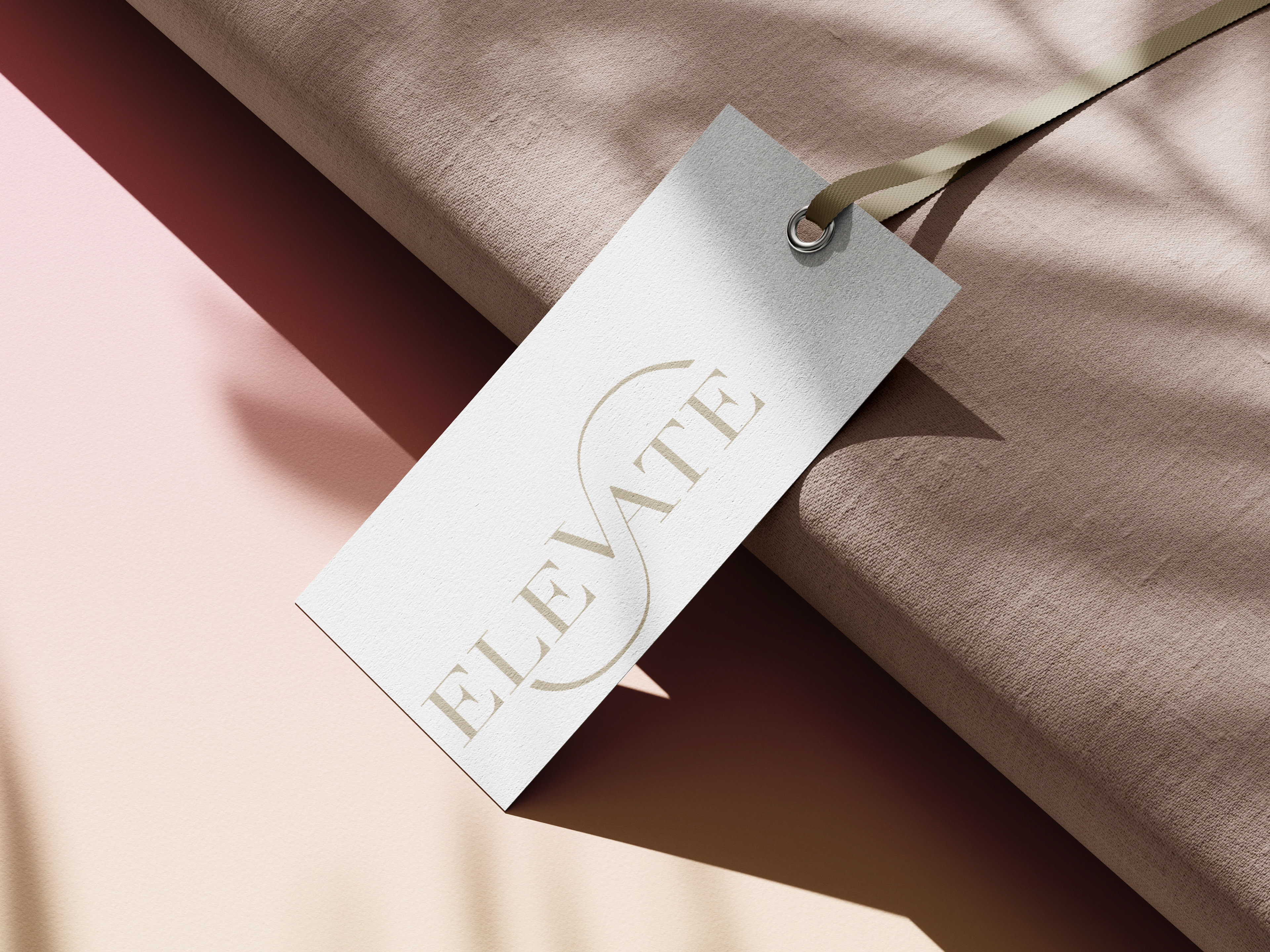
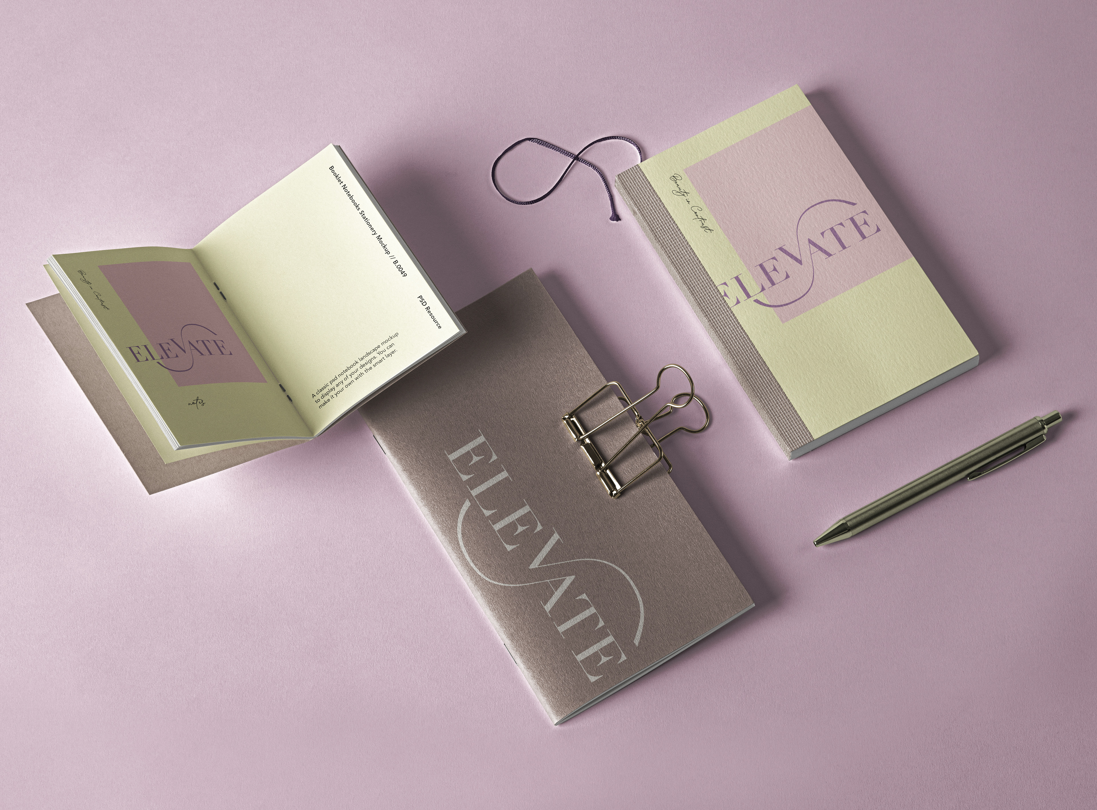
FINAL MARK: The thick strokes compared to the thin stroke created a beautiful contrast that ballet represents. The choice of extending the thin stroke of the A and the A created a sense of movement in contrast with the static capitals of the rest of the icon. Not only did the decision of lifting the V above the natural cap heigh create a literal meaning of "ELEVATE," but also gave depth and visual interest to the icon.

APPLICATION: Because the icon was heavily based on the beauty of balled, the application of this wordmark was simple; "Let's create a brand that includes the basic needs typically found inside of a ballet dancer's bag." A few seen here include a pointe shoe bag, a name tag similar to that of an ID tag commonly found on luggage, and note-taking supplies.