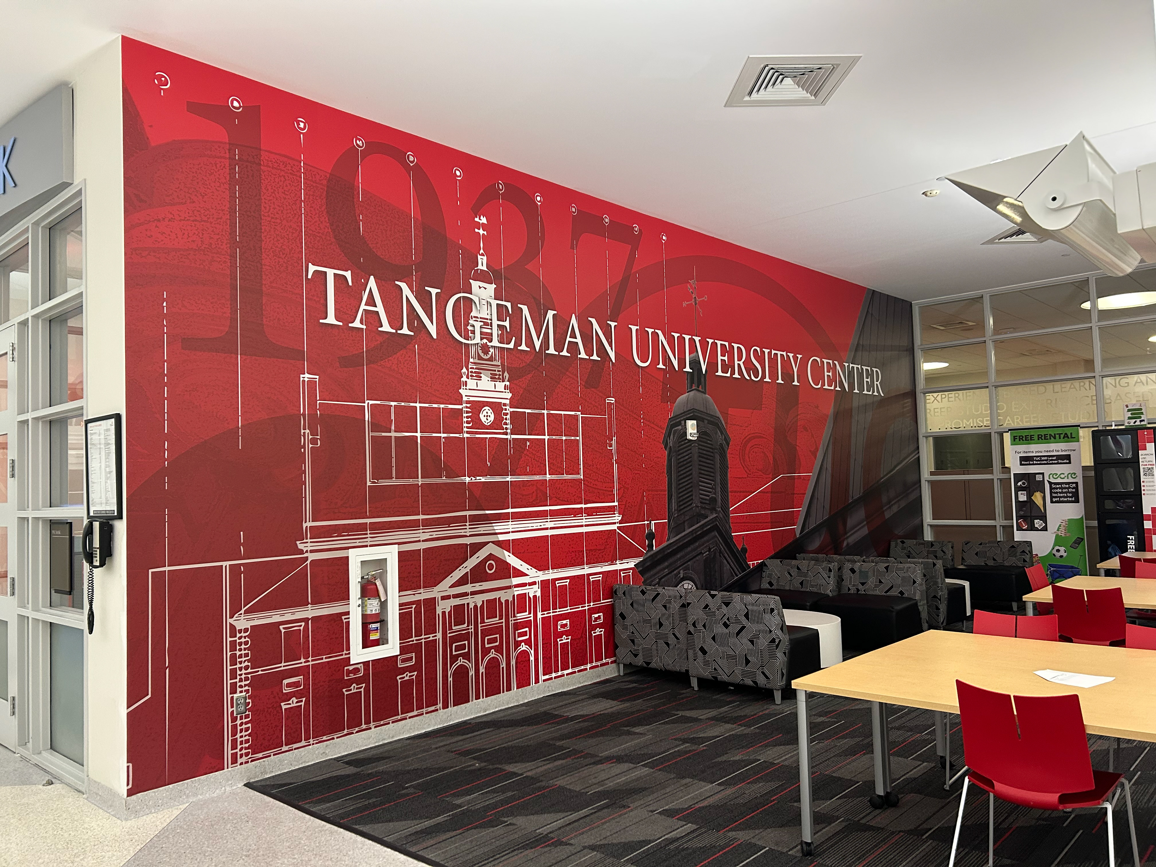
THE OBJECTIVE: Tangeman University Center (TUC) was originally named "The Union." This is because it was built in order to be the heart of campus and hold a number of student life and campus opportunities. There were 3 major locations in TUC that I was tasked with making graphics for: a mural for the main open seating area, a timeless graphic to identify the location of the elevators, and the Bearcats Package Center.
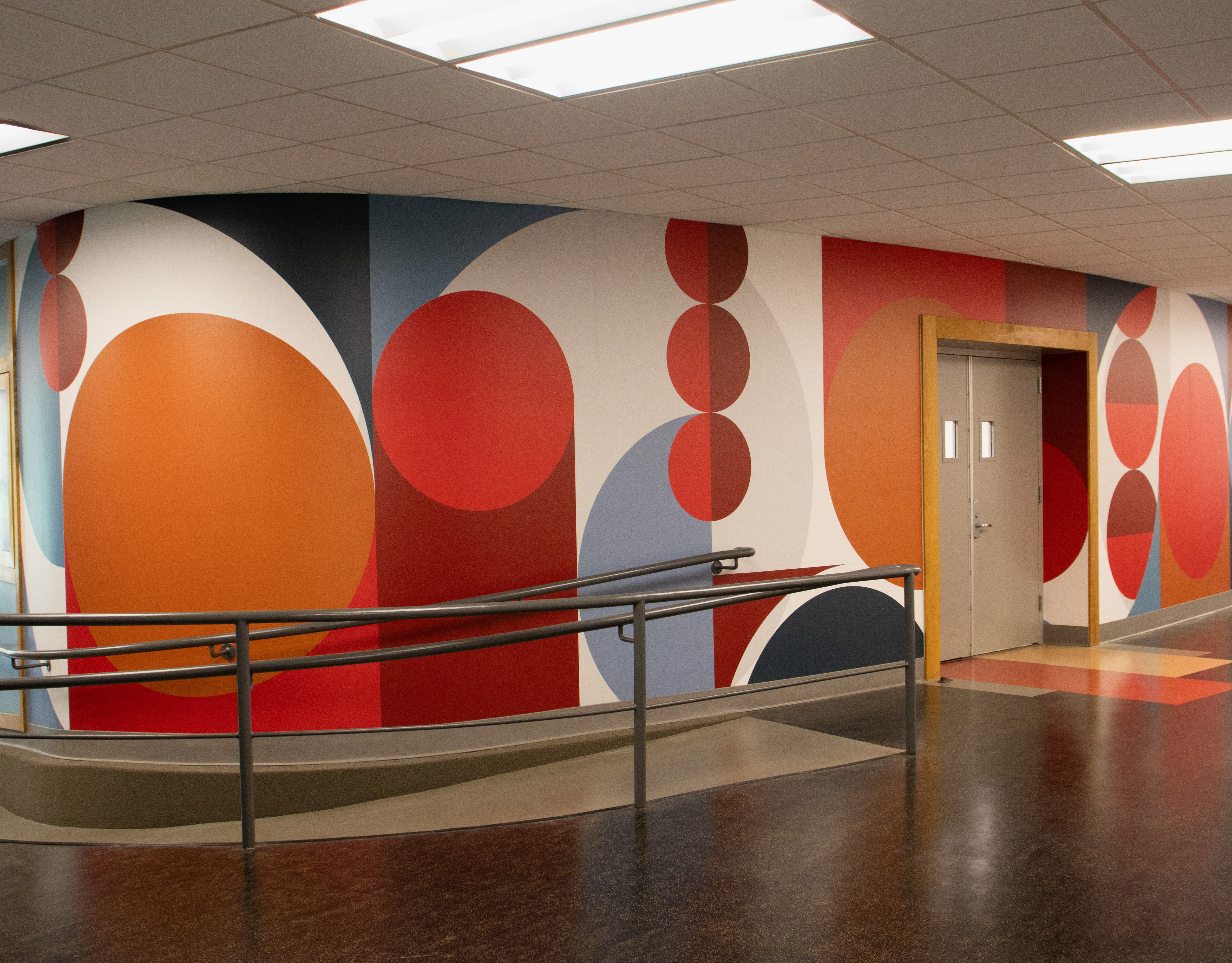
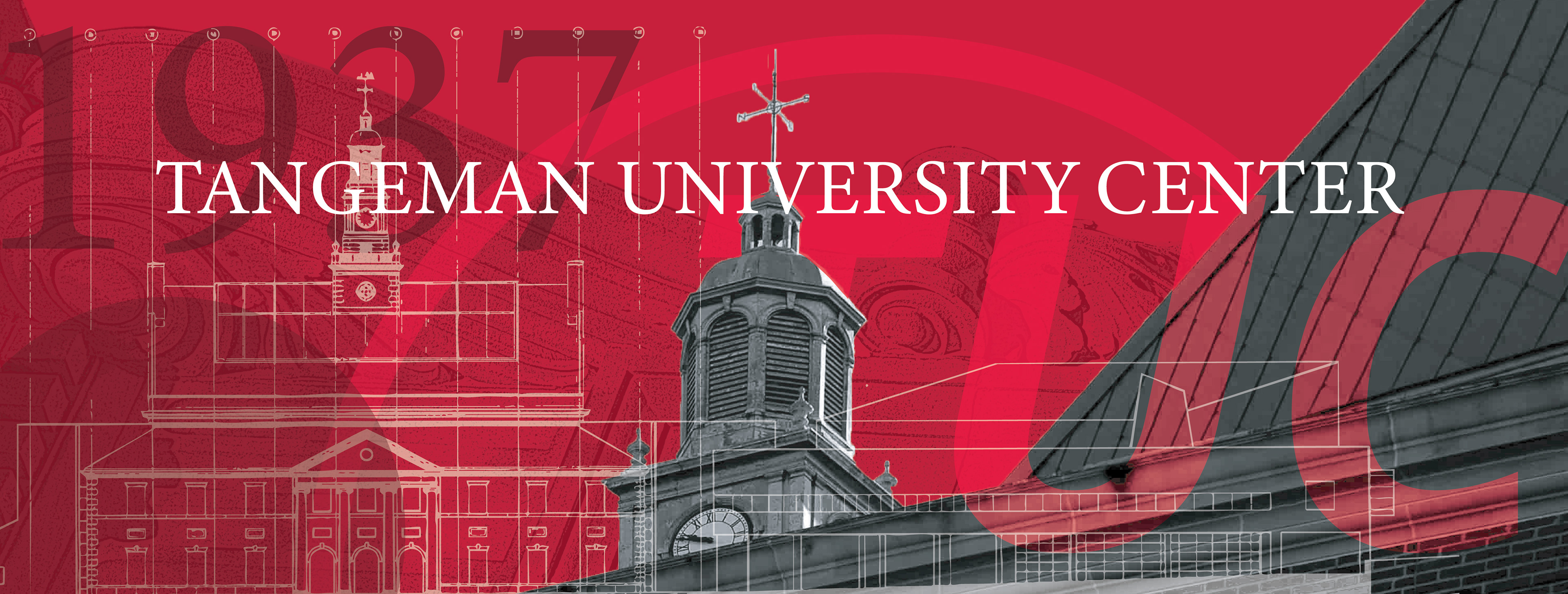
MURAL: I wanted to bring the architectural details and history of TUC into this mural. I knew that this would be a very large mural, so I had to be cautious of the sizing and not making it too busy. I got to research the history of how our well-known building came to be, and even used one of the original drawings from TUC's most recent structural update.
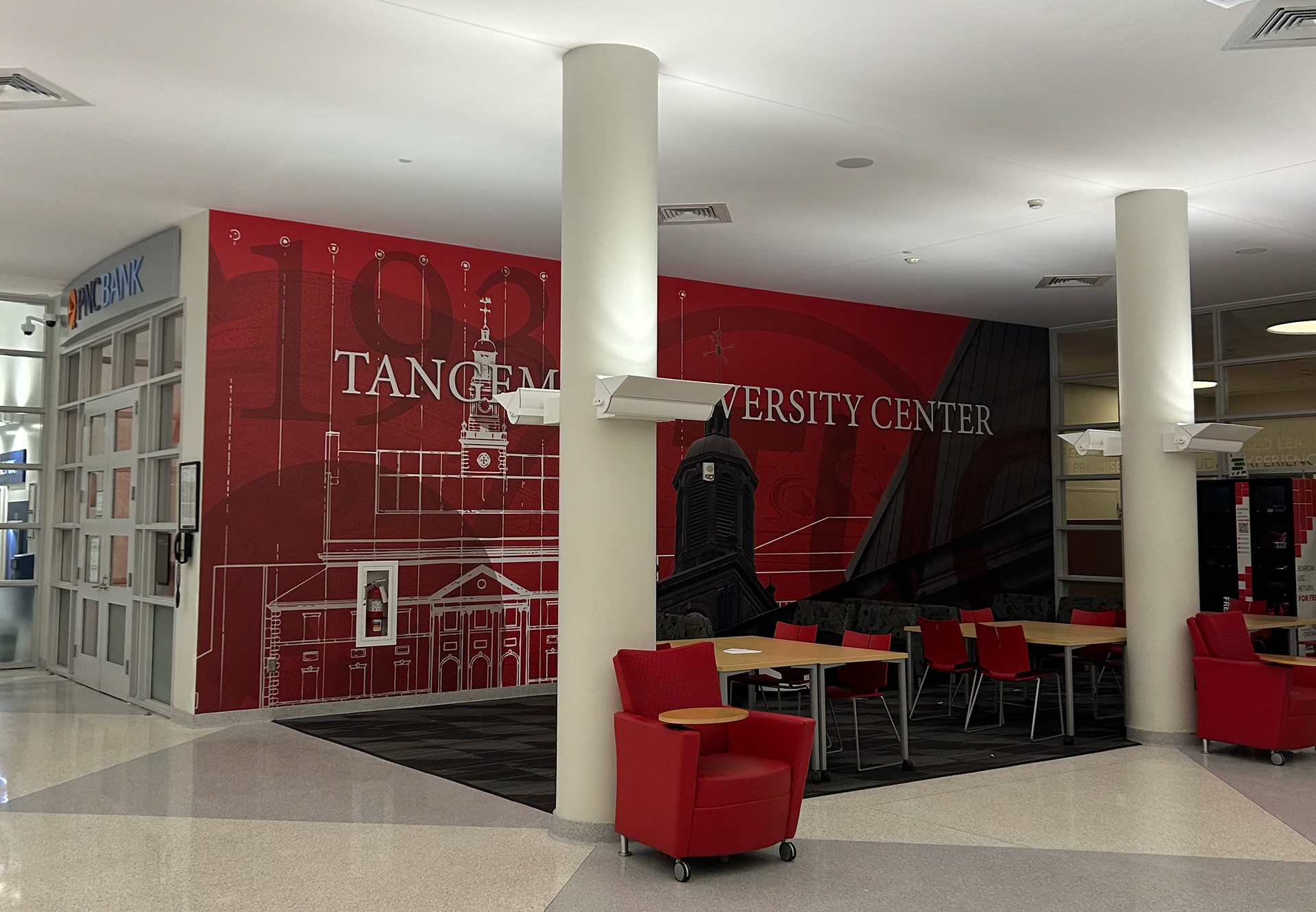
Installation

Installation
ELEVATOR GRAPHIC CONCEPT 1: This project was originally planned to be a shape-based pattern based off of the detailed architecture you can find on the building. The patterns below were based of off imaged found in the 1970s photo archive. This creating an interesting texture that was also meaningful.
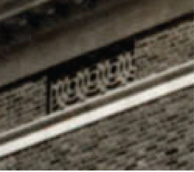
TUC 1970's


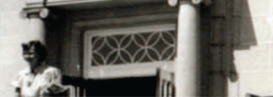
TUC 1970's


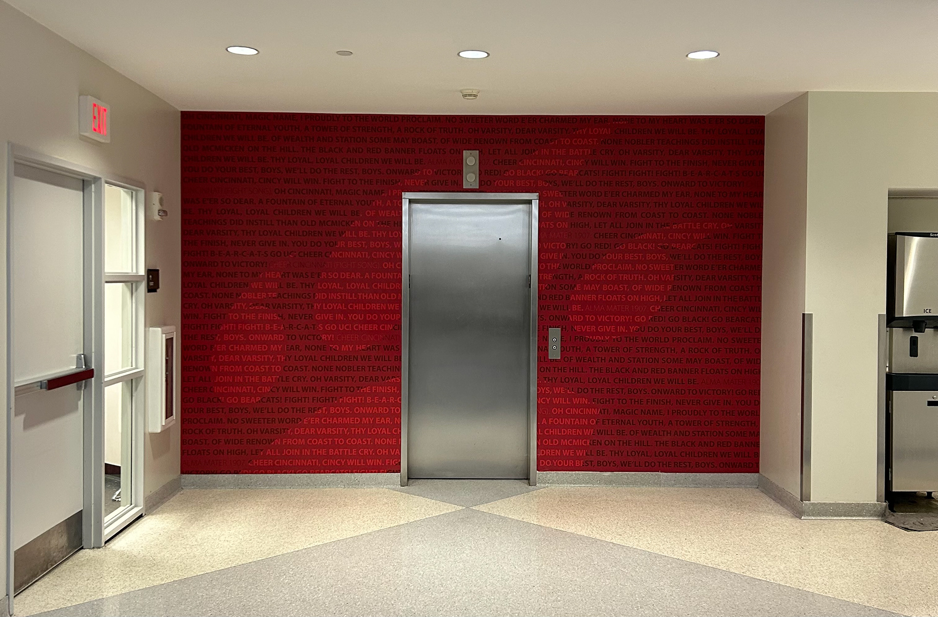
FINAL ELEVATOR GRAPHIC: While the historical aspect of the previous concept worked, the main floor mural already covered the historical architecture of TUC. Concept 2 has a more modern feel- the athletic C-Paw- with timeless aspects- the Alma Mater and Fight Song.
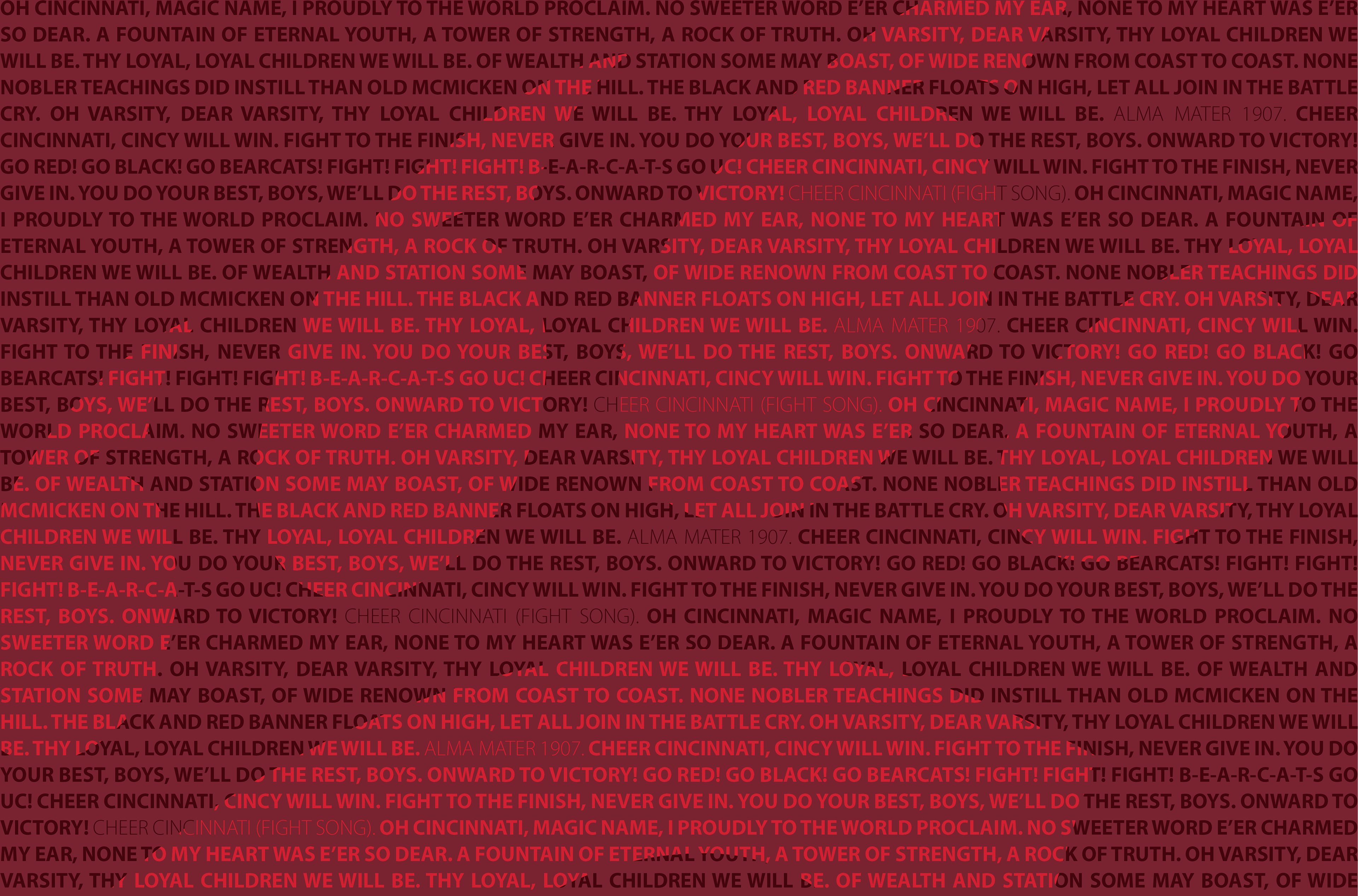
Artwork Details

Installation
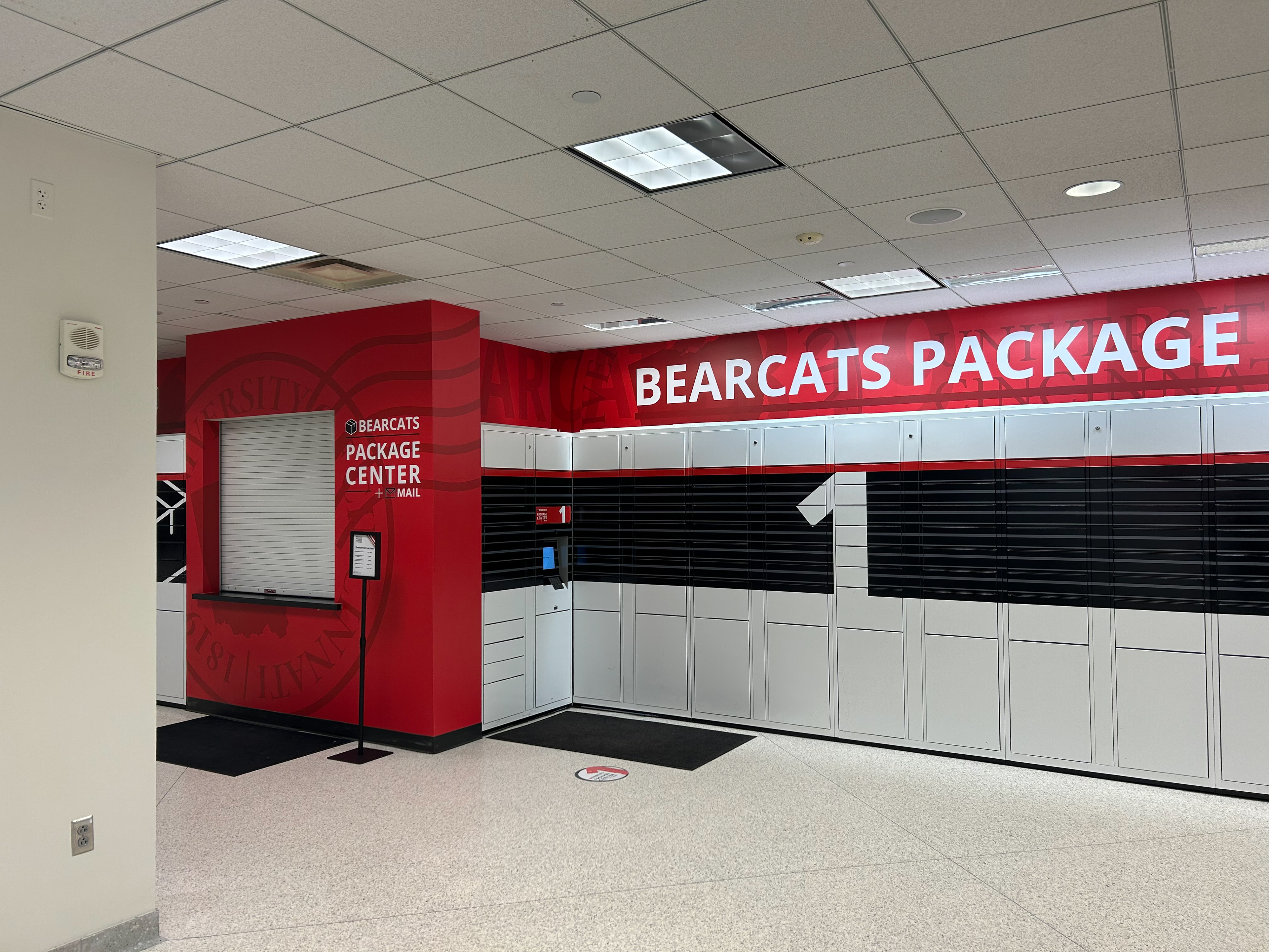
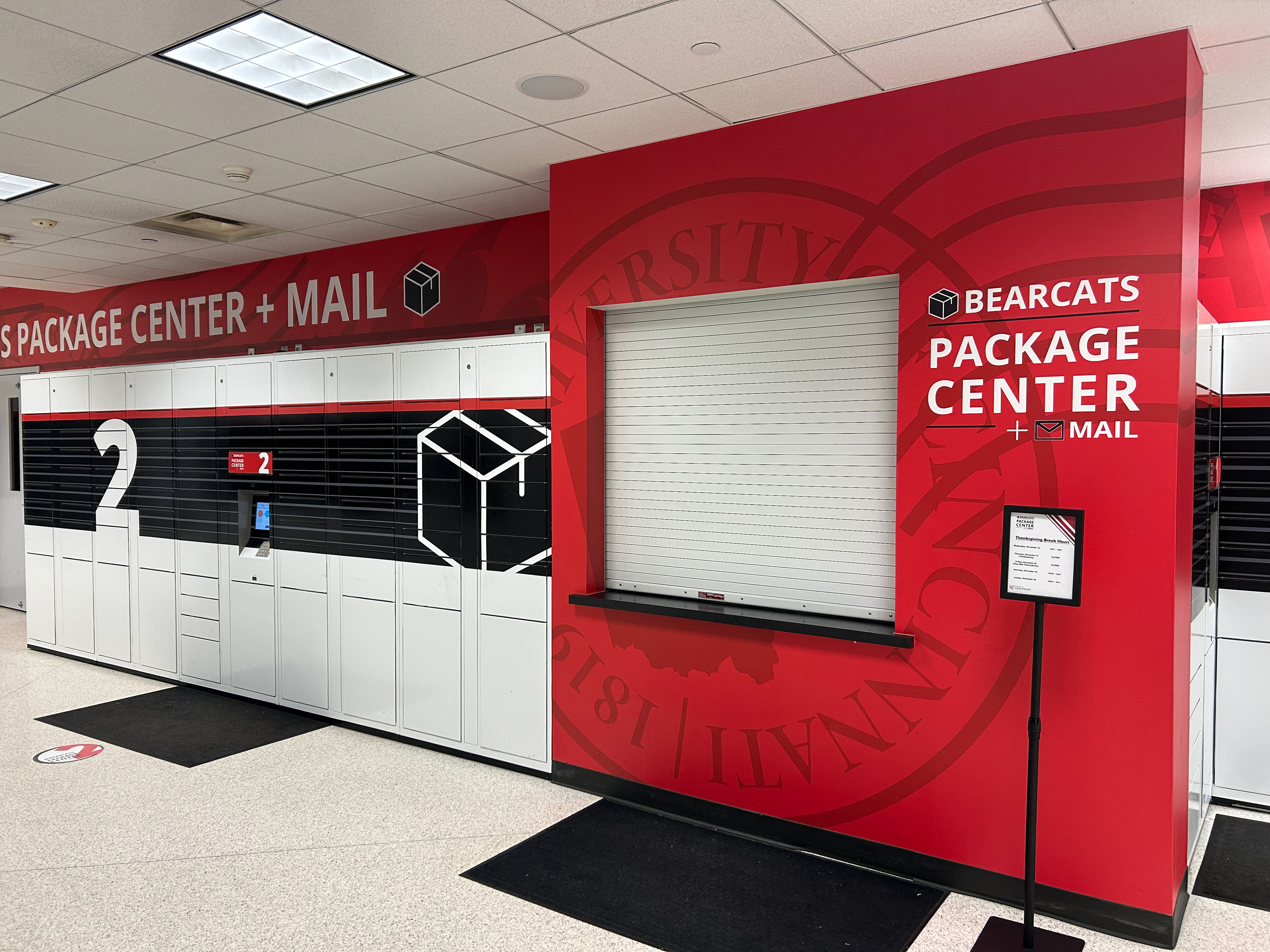
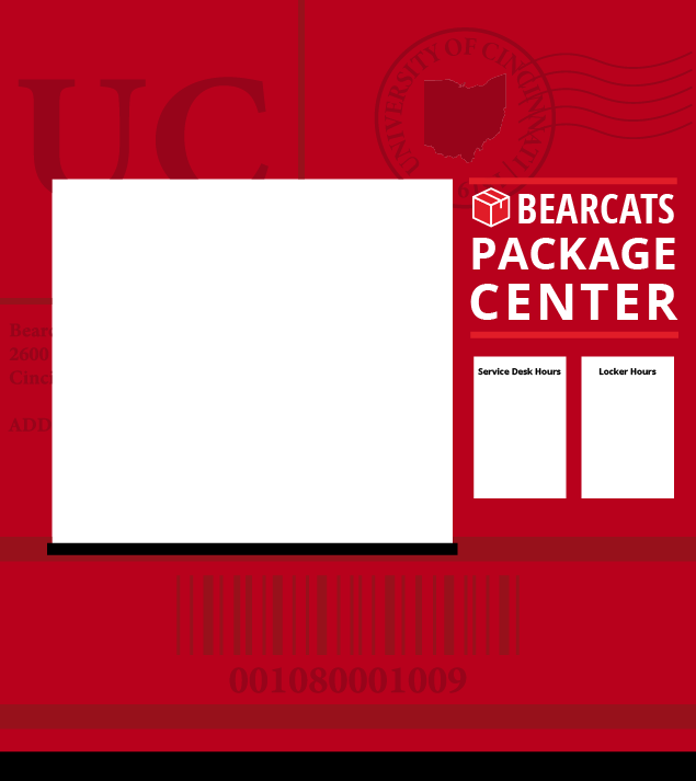
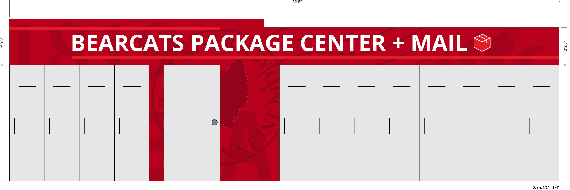
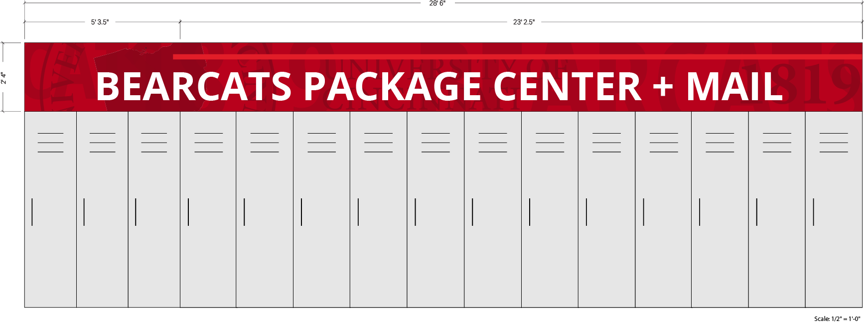
BEARCATS PACKAGING CENTER: Graphics were introduced to the Bearcats Packaging Center to draw more attention to it. This is a space that is tucked away in the corner of the bottom level, so it needed some color and liveliness to make it stand out. I created a personalized postmark for the University of Cincinnati and knew I wanted to run with the postage theme.
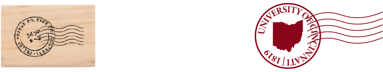
IDEATION: It ultimately came between two designs. The design on the right was inspired by a full shipping label that was customized with some hidden UC messages: the postage mark, the university's address, and the year that UC was founded- 1819- in the shipping number. We decided to go with the idea on the left, which is just the UC postage mark used as a tone on tone texture.
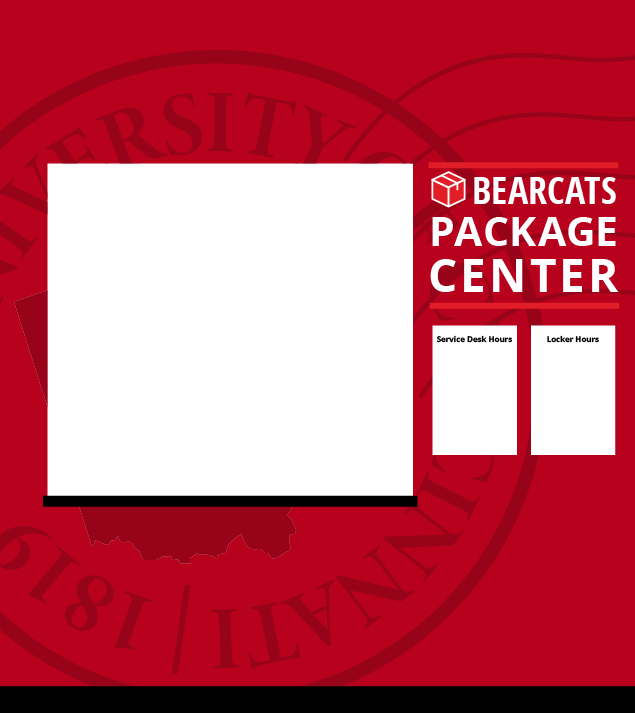
The graphics for above the lockers mirror the layered texture that you see in the main floor mural.

Installation