THE OBJECTIVE: Proctor Hall is an essential building to the University of Cincinnati's prestigious nursing program. Being a learning environment, we wanted to introduce a more interesting, inviting, and colorful space. With the help of UC's Planning + Construction + Design environmental graphic team's art direction, I was tasked to redesign the branding for- and give a brighter environment to- the nursing program.
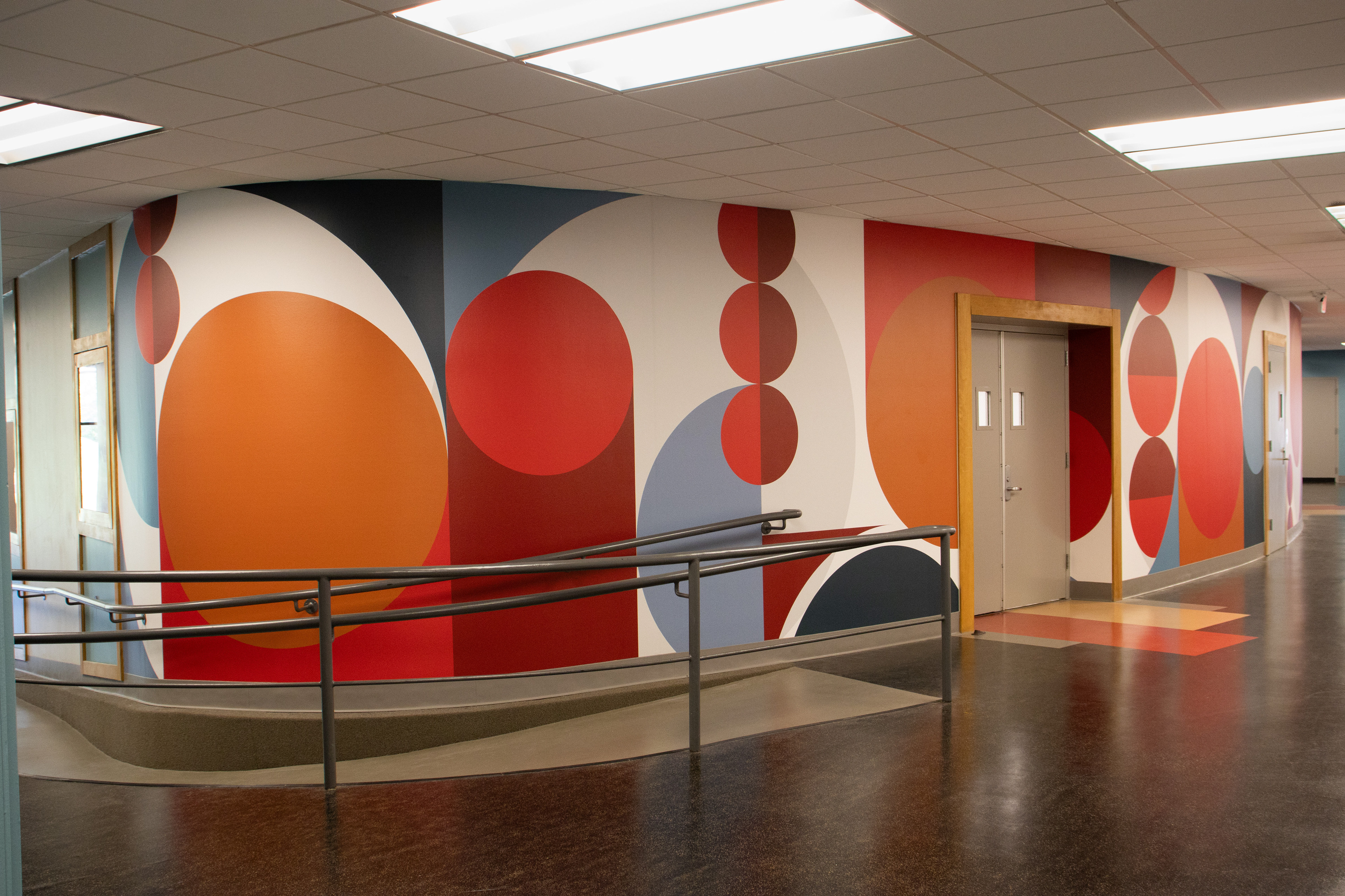
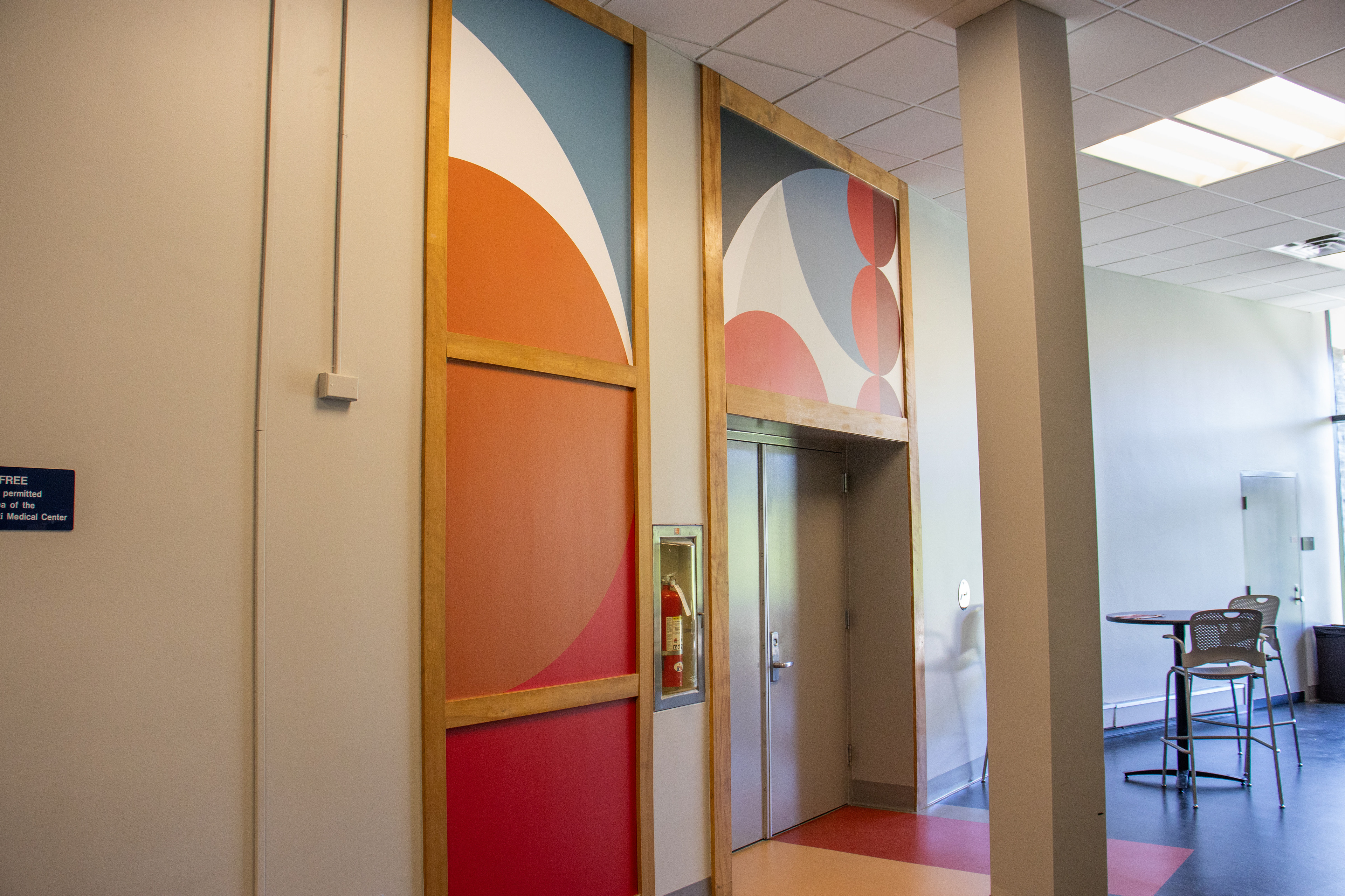
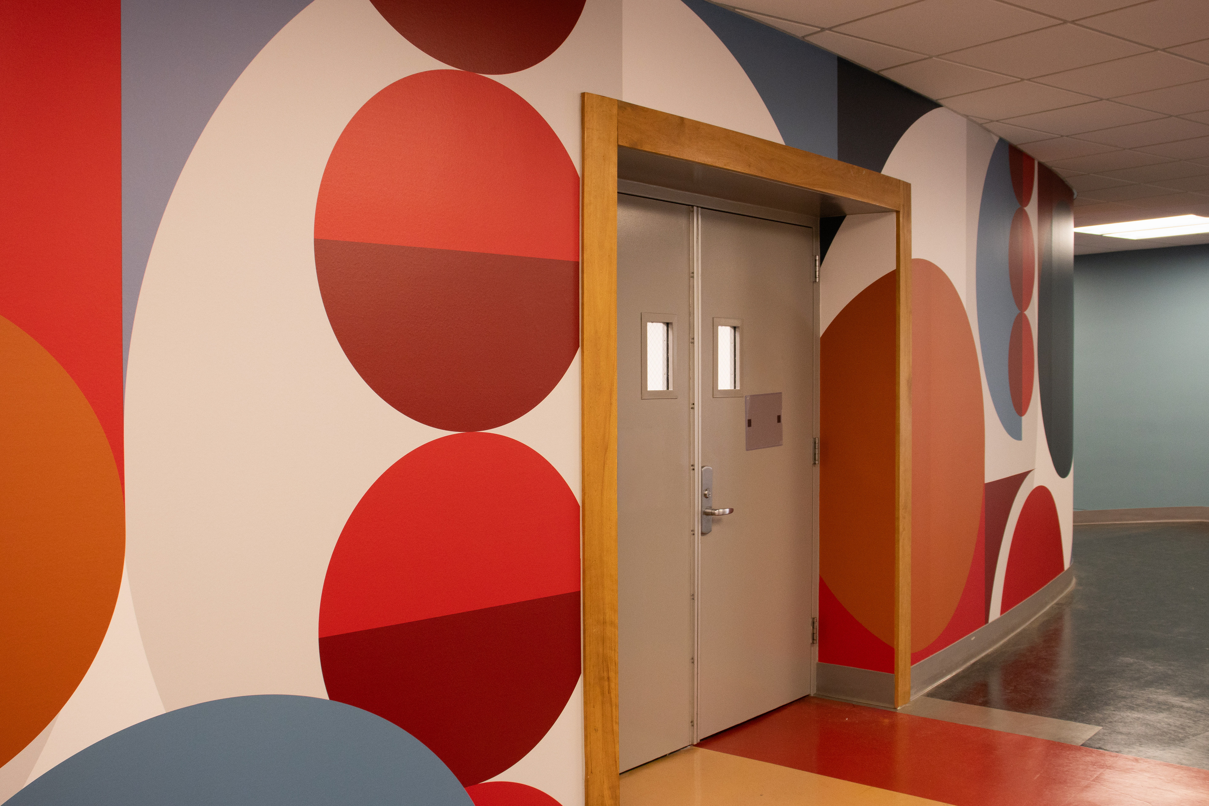
MOOD BOARD & INSPIRATION: The lobby area of introduced an orange and a teal color not seen anywhere else on campus. This sparked the idea to create an identity using those two colors. We decided to adjust our palette to include both the branded UC dark red and UC red in order to make sure that this building is still recognizably part of a University of Cincinnati program.

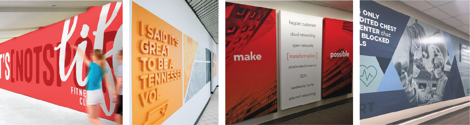
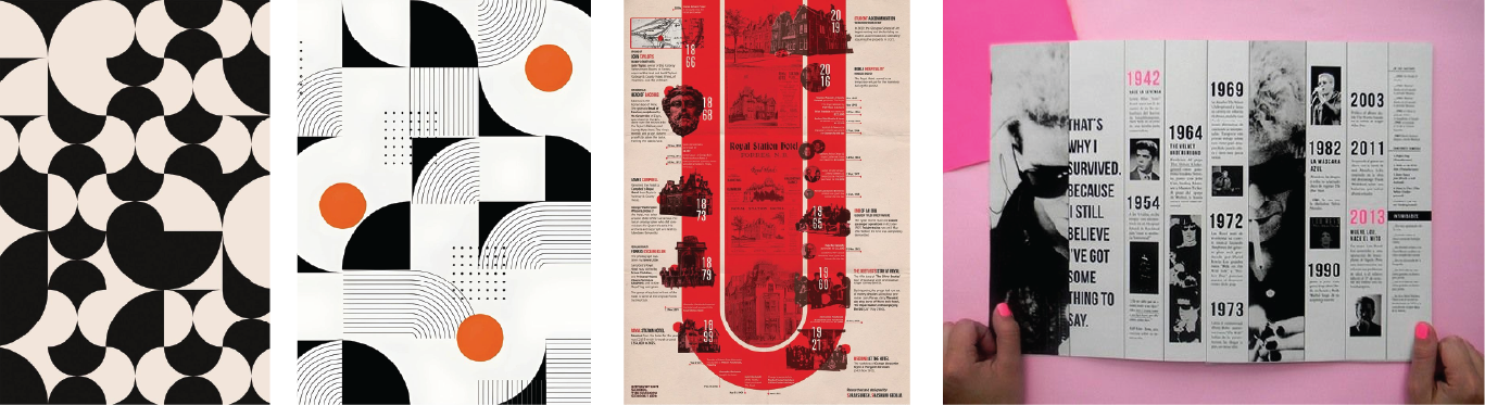
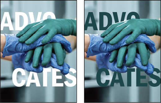
EARLY SPRINTS AND IDEAS: The words: impact, innovation. welcoming, uplifting, advocates, and empowerment are what drove this project. It started out with a number of design sketches and sprints, trying to decide if this project should be text or image heavy. The answer was neither! It was debated whether we should use canvas wrapped panels, wallpaper, or a mix of both. With the timeline we were given, it was best to create an interesting shape-based wallpaper in order to cover more surface area in a short amount of time.


Let's switch it up


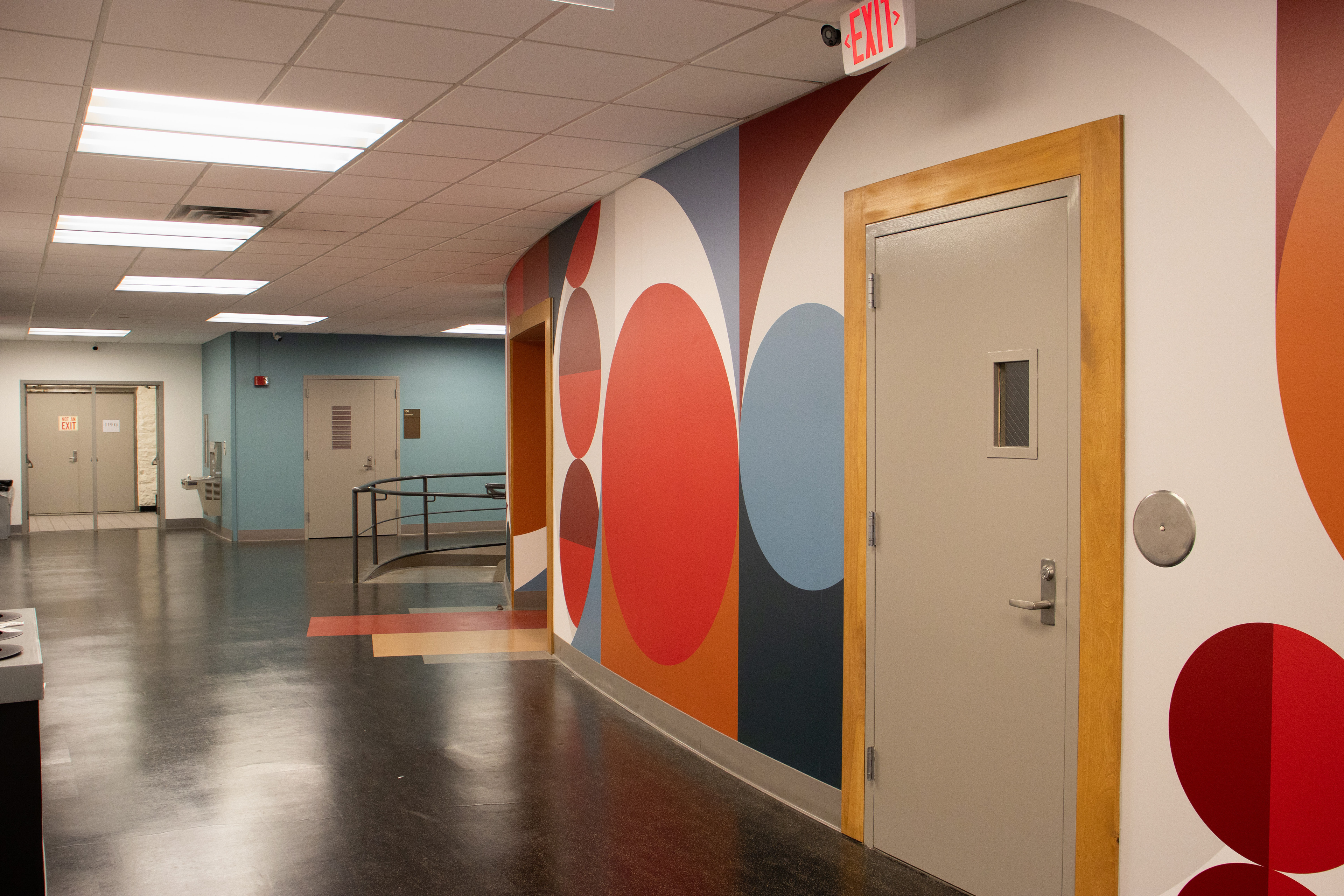
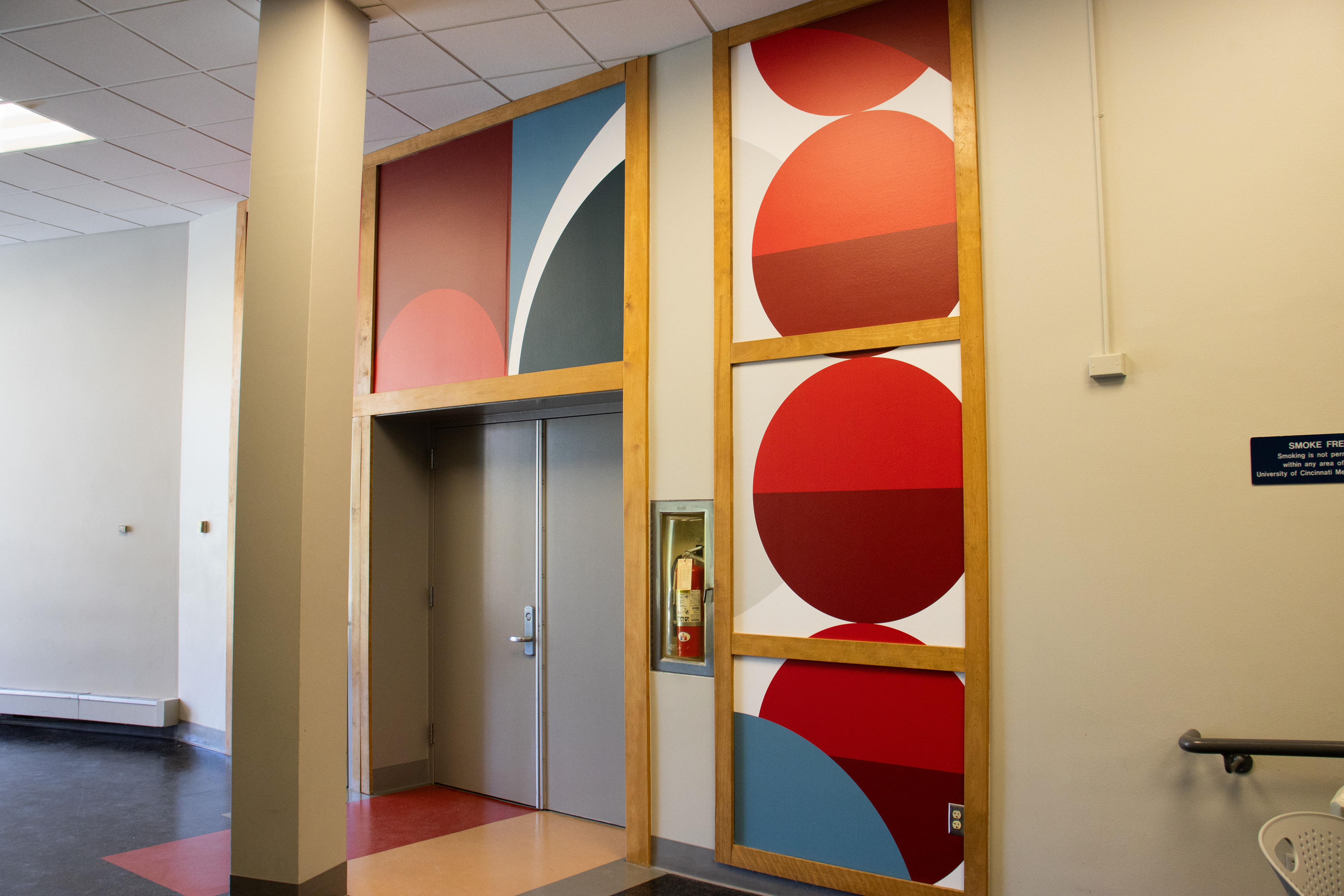
FINAL PATTERN: The final pattern includes each color from the color palette. Instead of using just the typical University of Cincinnati's red and dark red with some gray accents, we wanted this space to feel more personal and branded towards the nursing program.

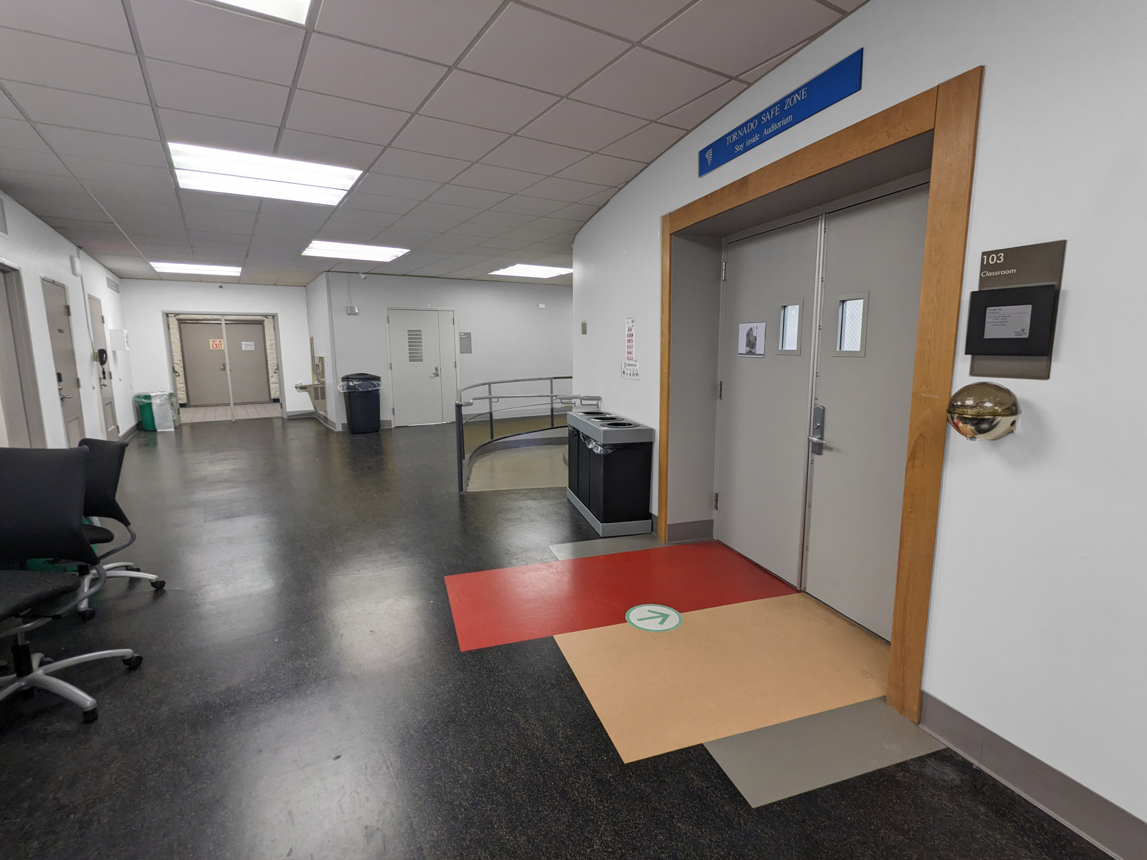
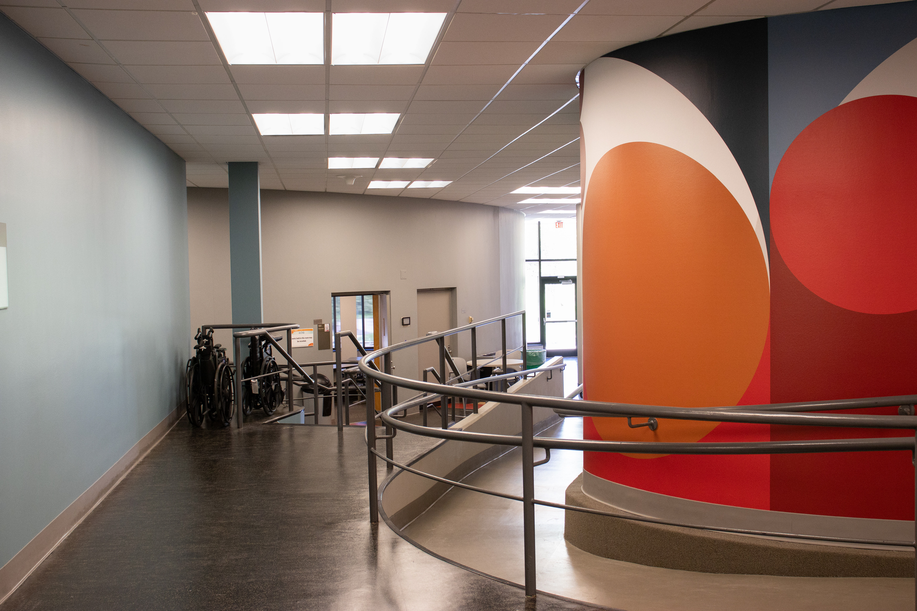
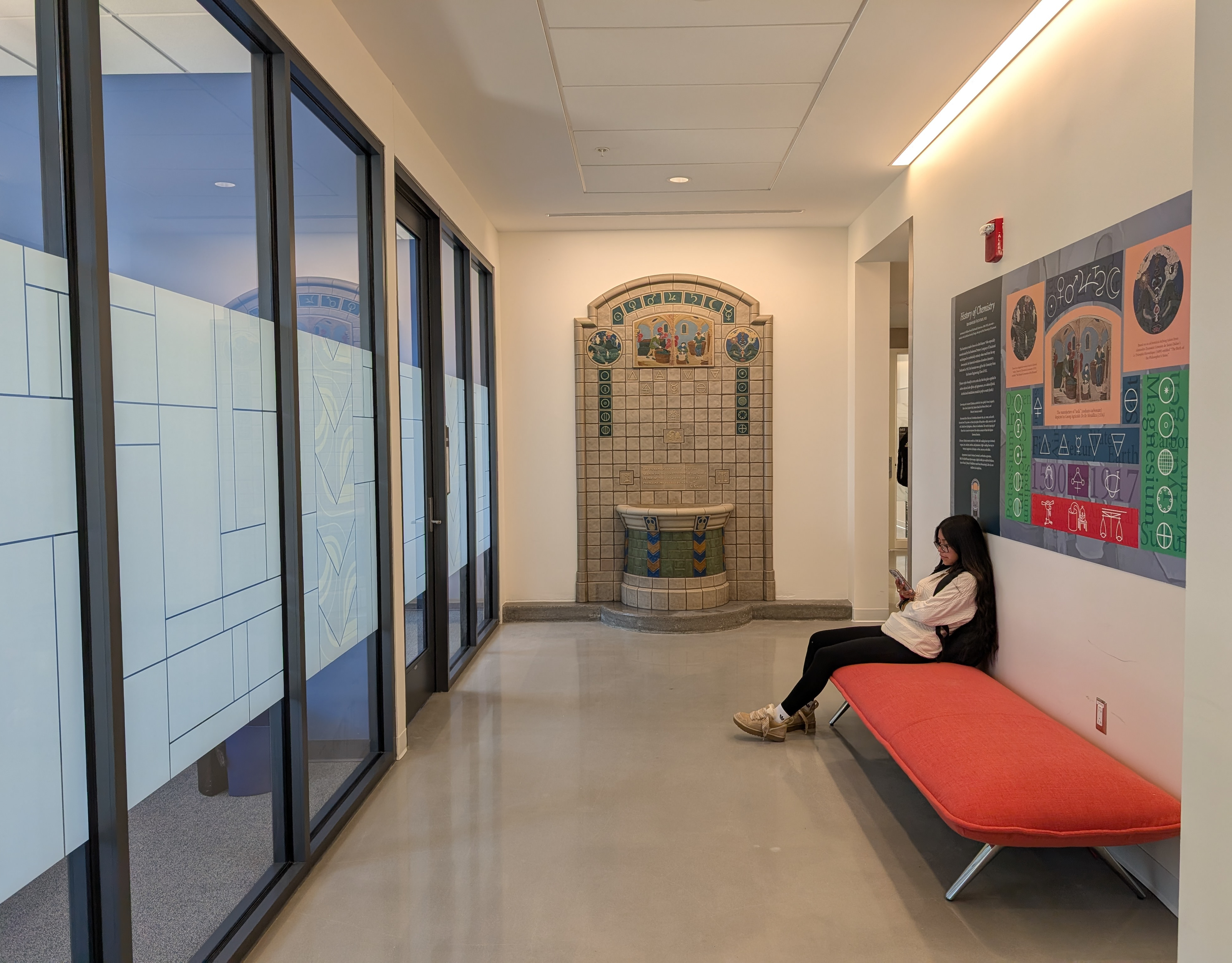
A blank slate
Before graphics
Floor 100 Installations