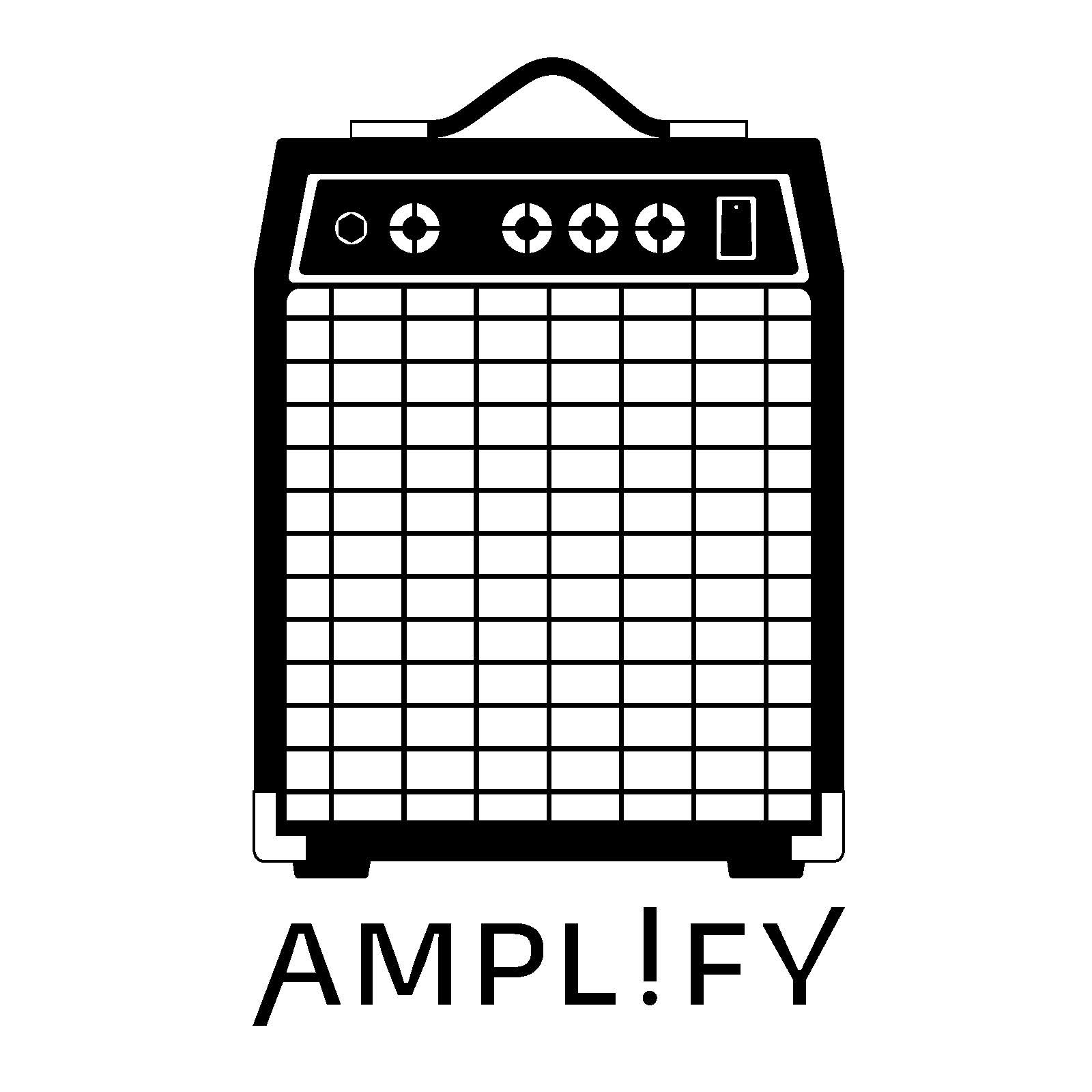
OBJECTIVES & OBSERVATIONS: The objective of this project was to take an object of your choosing and create a digital icon to represent that object best. The key aspects of the amp to be included in a digital translation were; the slight taper of the adjustment panel while still including the boxy shape, only including key details of the knobs and switches for the best chance of recognition at a small scale.
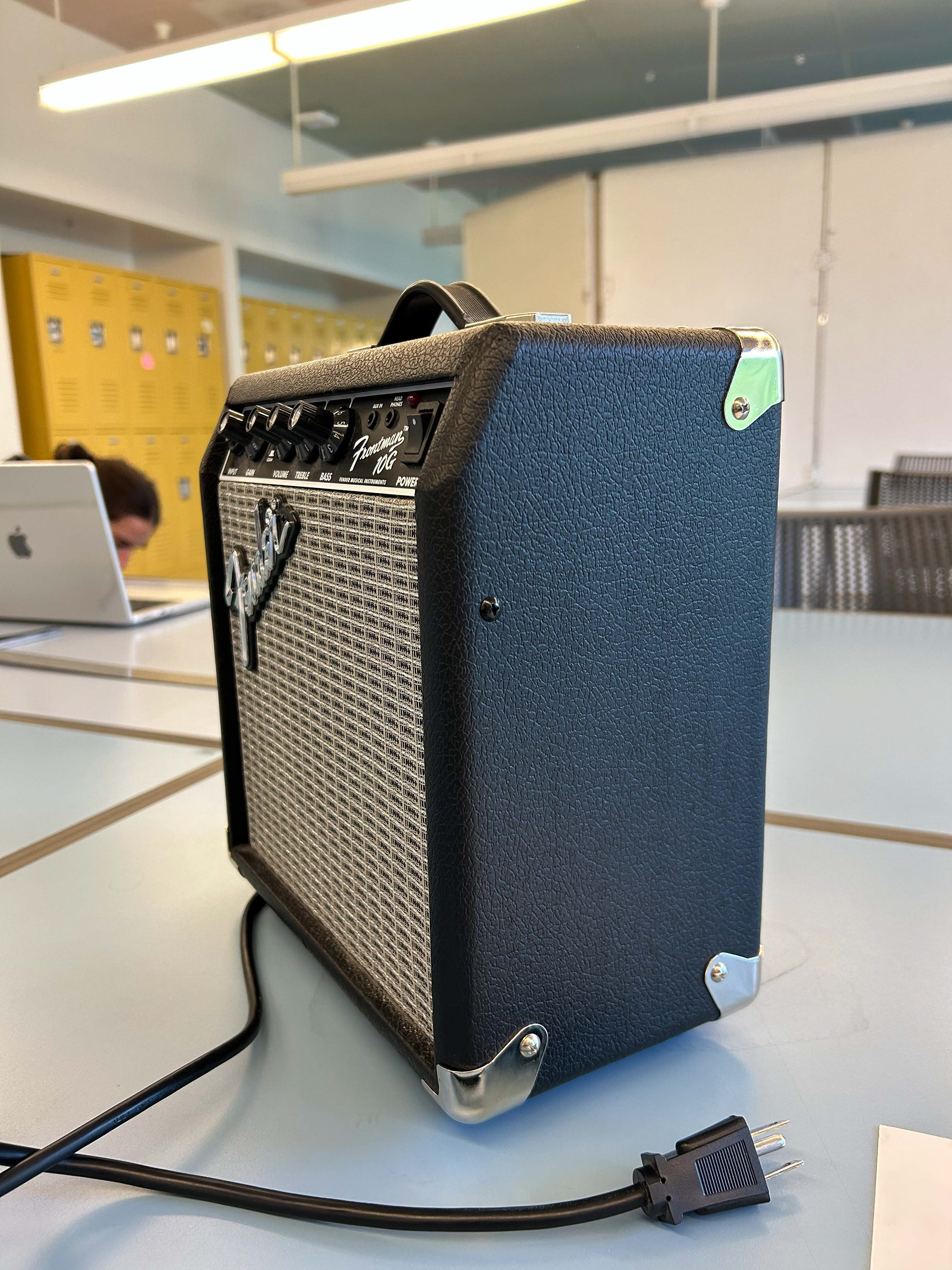
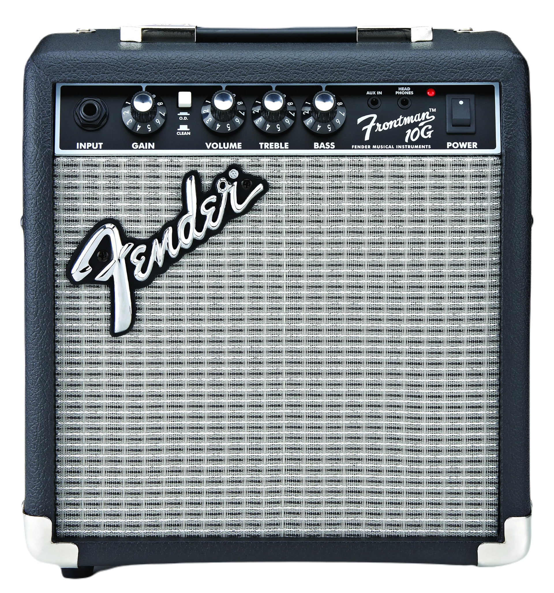
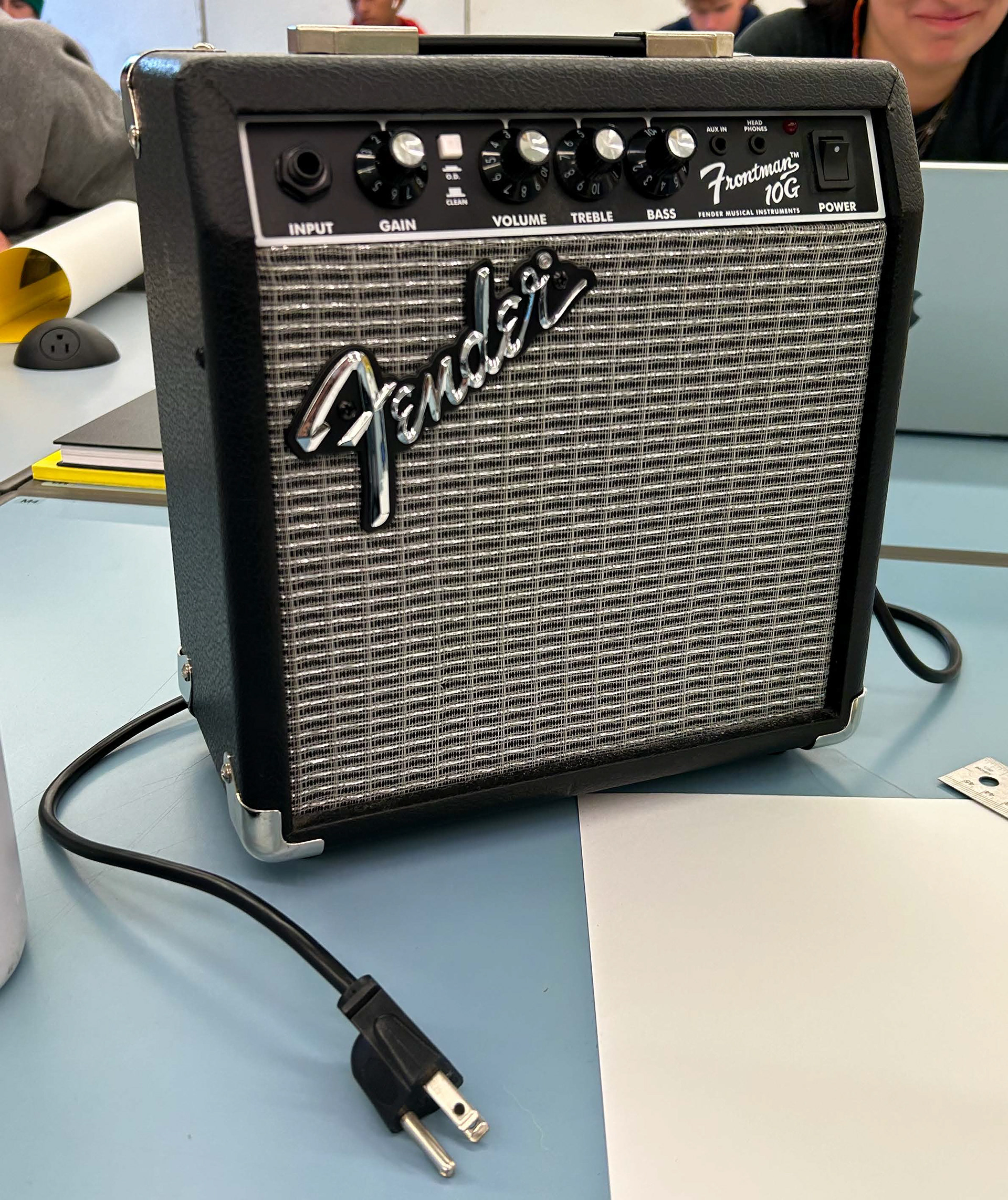
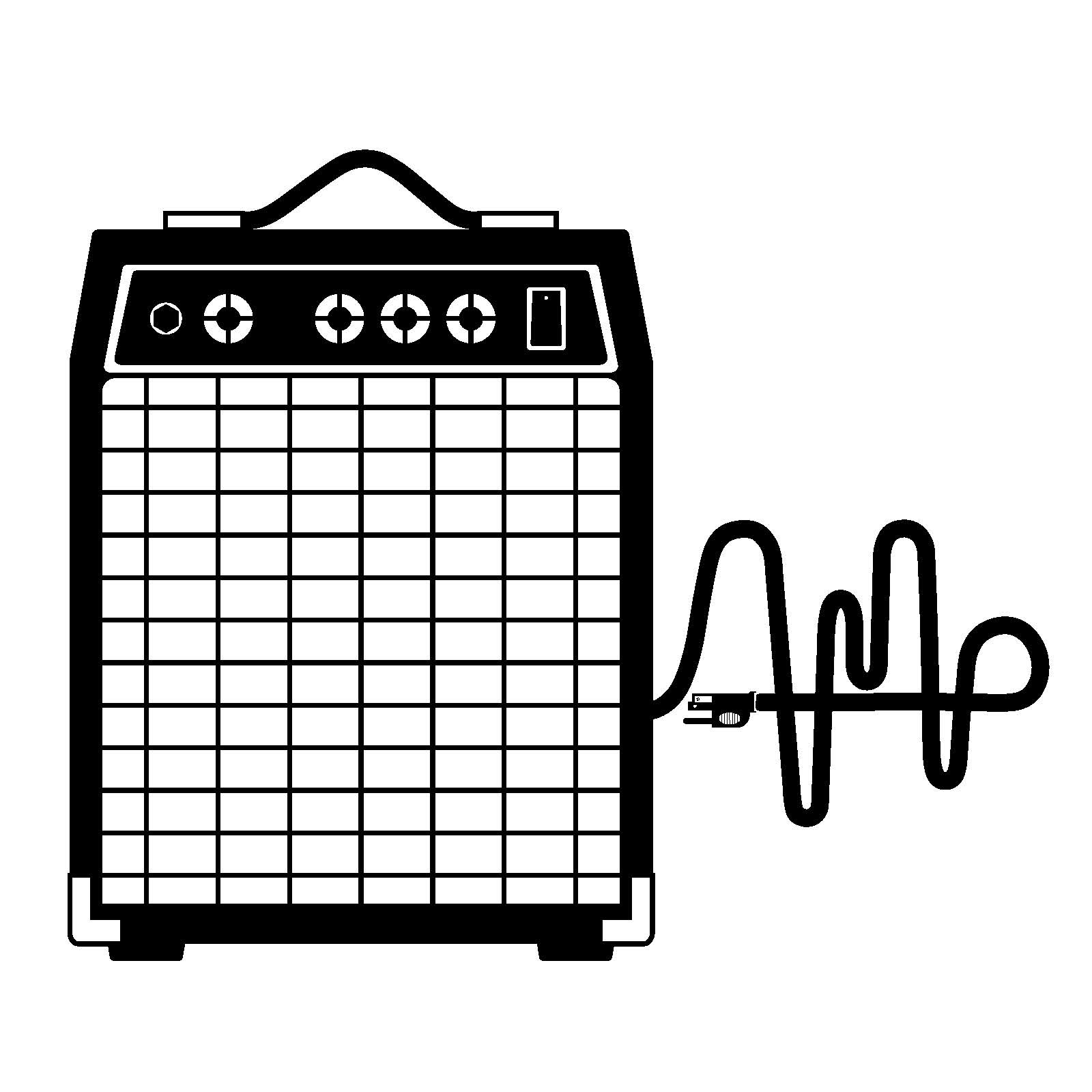
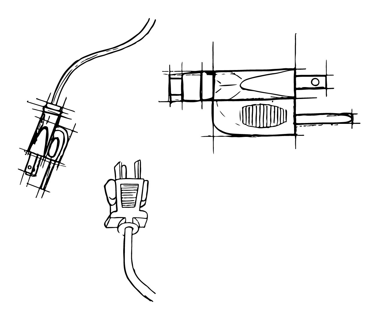
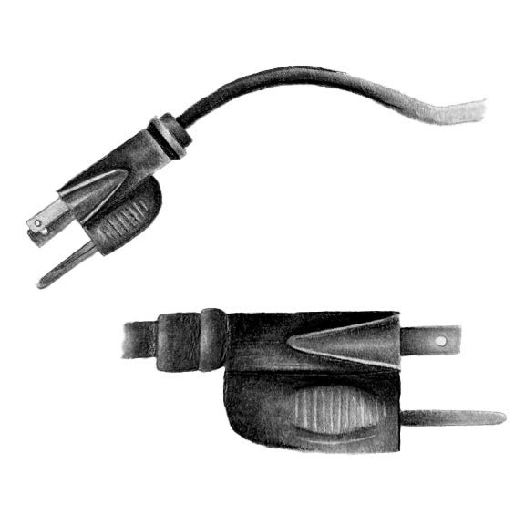
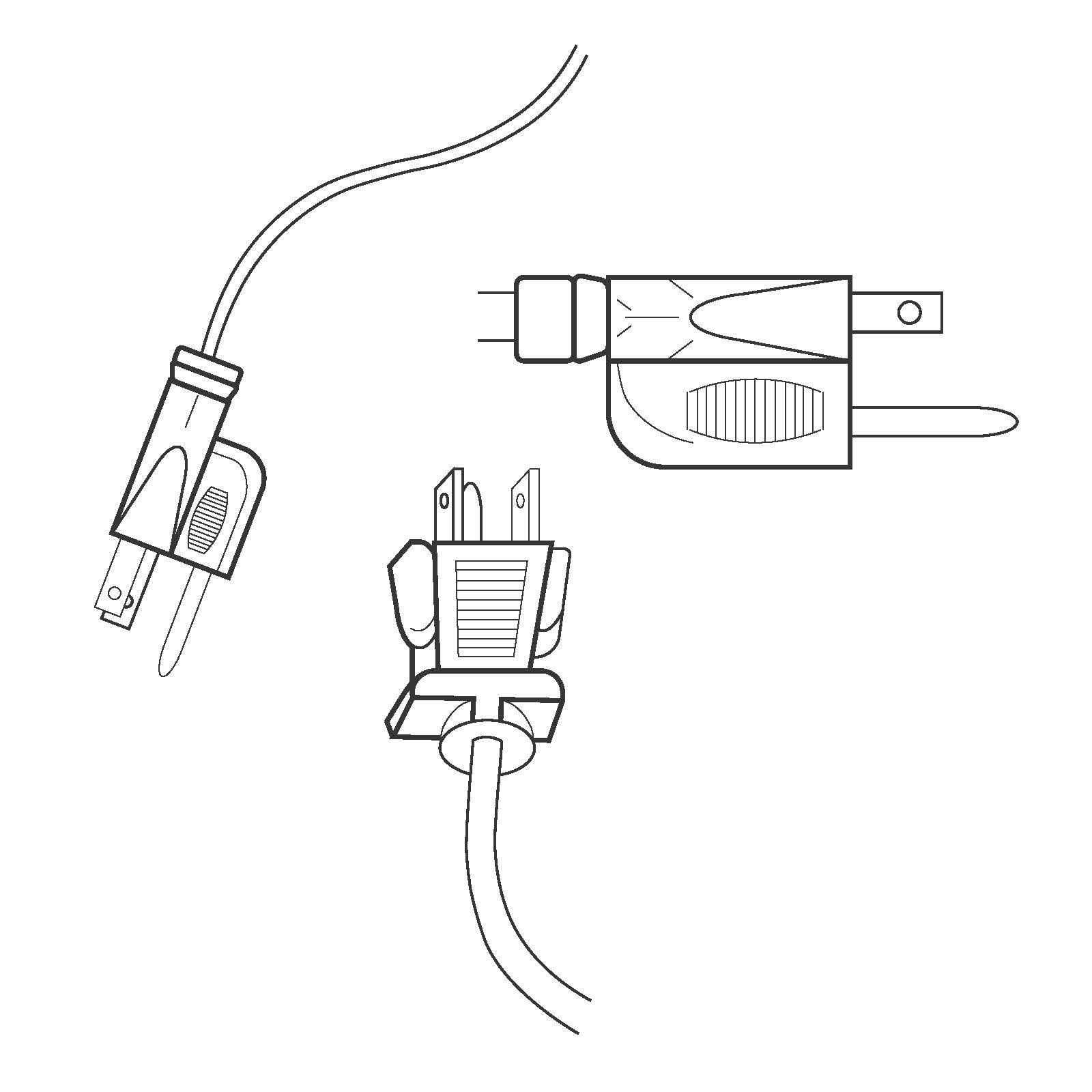
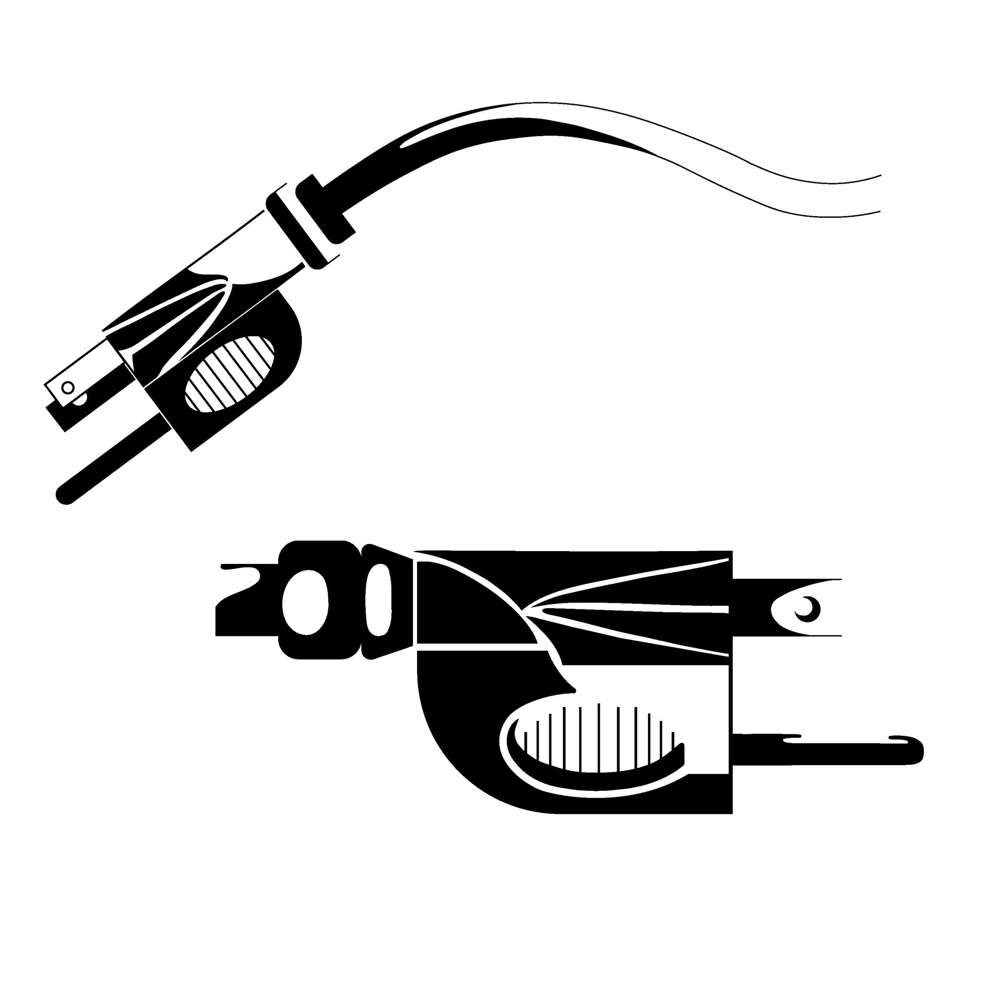
CONCEPT 1 SKETCHES: This project began with creating analytical drawing of the objects in order to find the best angle that is most recognizable. the 3/4 view seemed like the best fit for the amp as a whole. It was a debate whether or not to include the chord to add a natural component to the static nature of an amp. Analytical lead to real, shaded drawing that were taken into consideration when creating the icons.
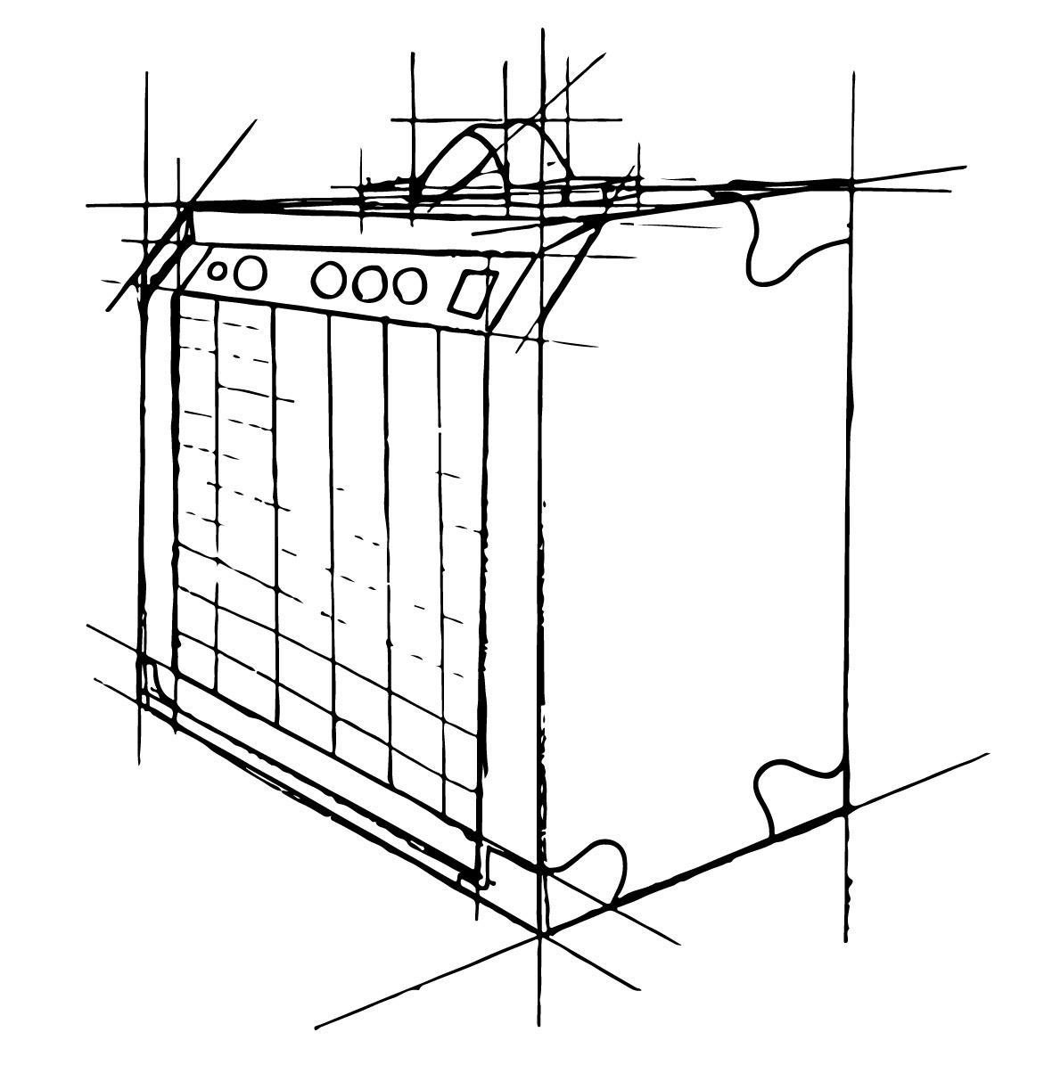
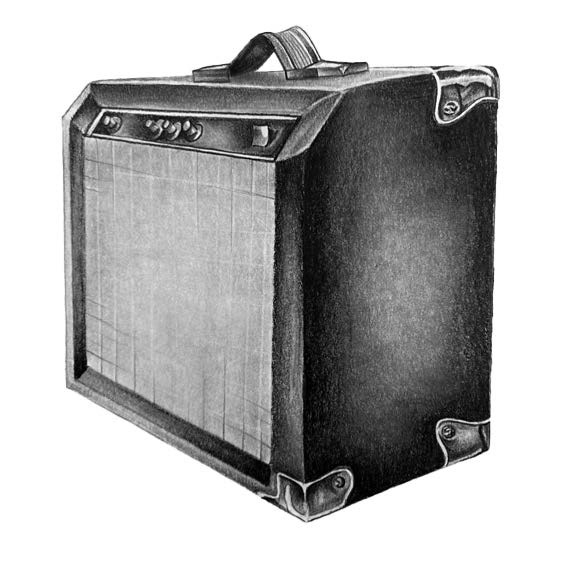
CONCEPT 1 LINE ARTICULATION AND ICONS: The digital process began with line articulations, and then gradually adding shapes and negative space in order to create the black and white icon. At this point the 3/4 angle was still working as the most recognizable angle of the amp, but then took a turn in the process.
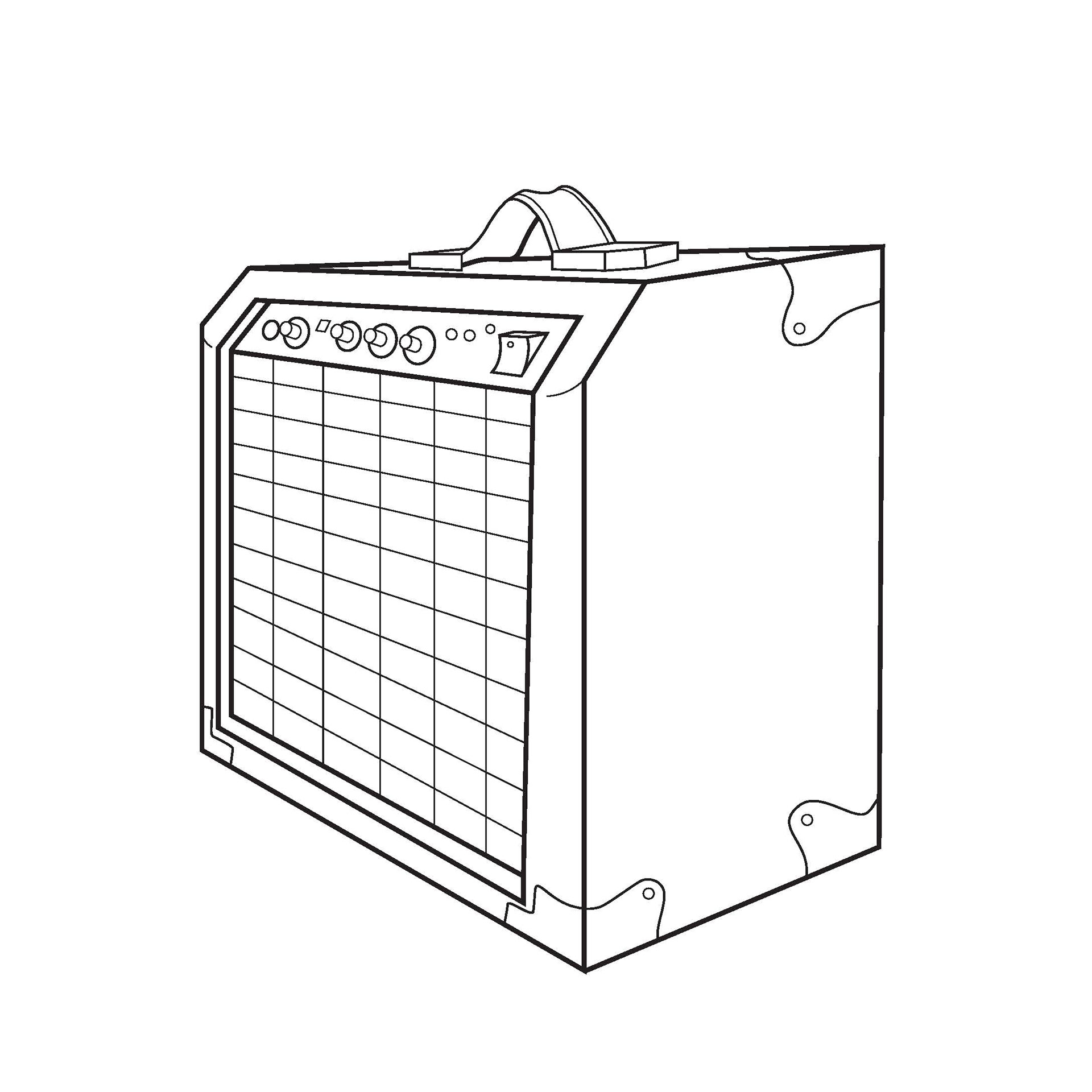
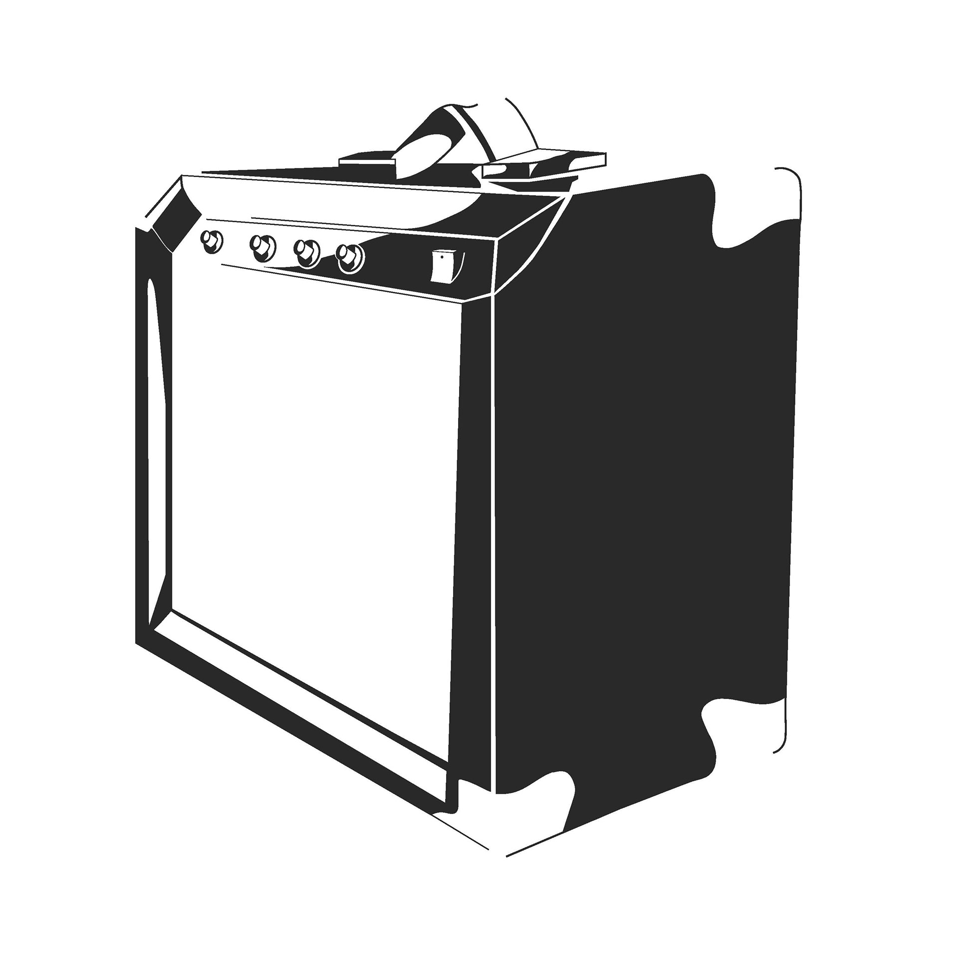
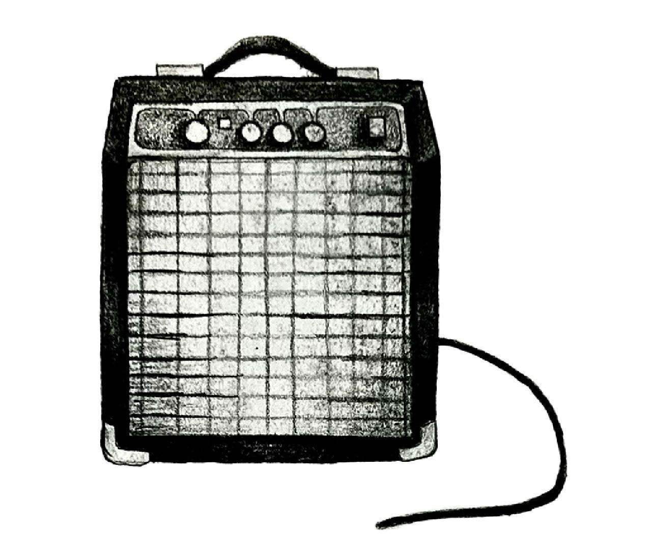
CONCEPT 2 SKETCHES: While the first concept worked, it was not the most idea icon for the amp. Concept 1 proved to be unrecognizable at a small scale due to the amount of detail used to show each separate part of the amp. This led to concept 2, while is a complete profile view and does not include the chord.
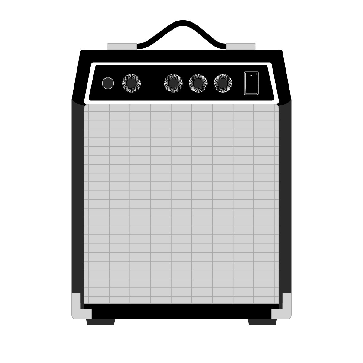

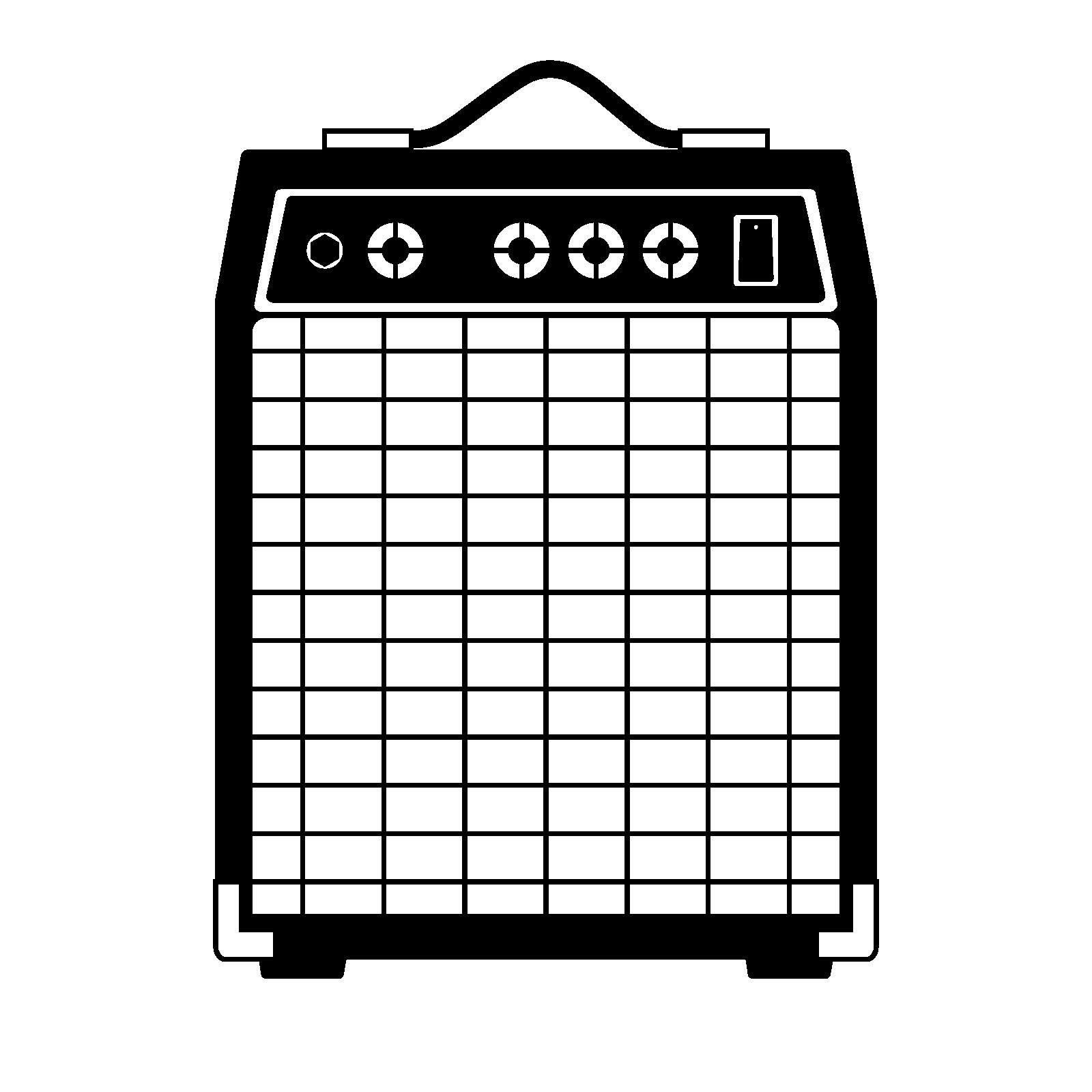
FINAL ICON: For the sake of simplicity, the head-on angle without the chord proved to be the best way to represent the amp. This allowed for the icon to still be recognizable at a smaller scale by not having as many tiny details as the 3/4 view held.

APPLICATION: The final aspect of this project was an optional application of a brand name, the use of color, or creating a rendered model. I chose to use the addition of a brand name to support my icon. The application on the left's logo extended the stroke of the A and the Y, and also uses an exclamation point for the I to emphasize the increasing sound you get when using an amp. The application on the right experimented with bringing back the idea of a natural curve in contrast to the static box while still mirroring the handle on top.